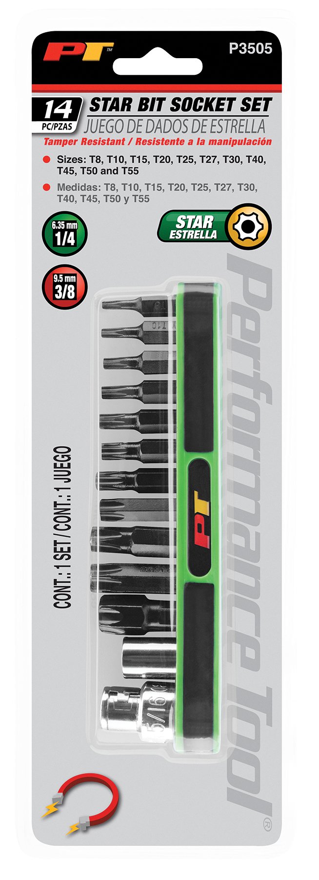
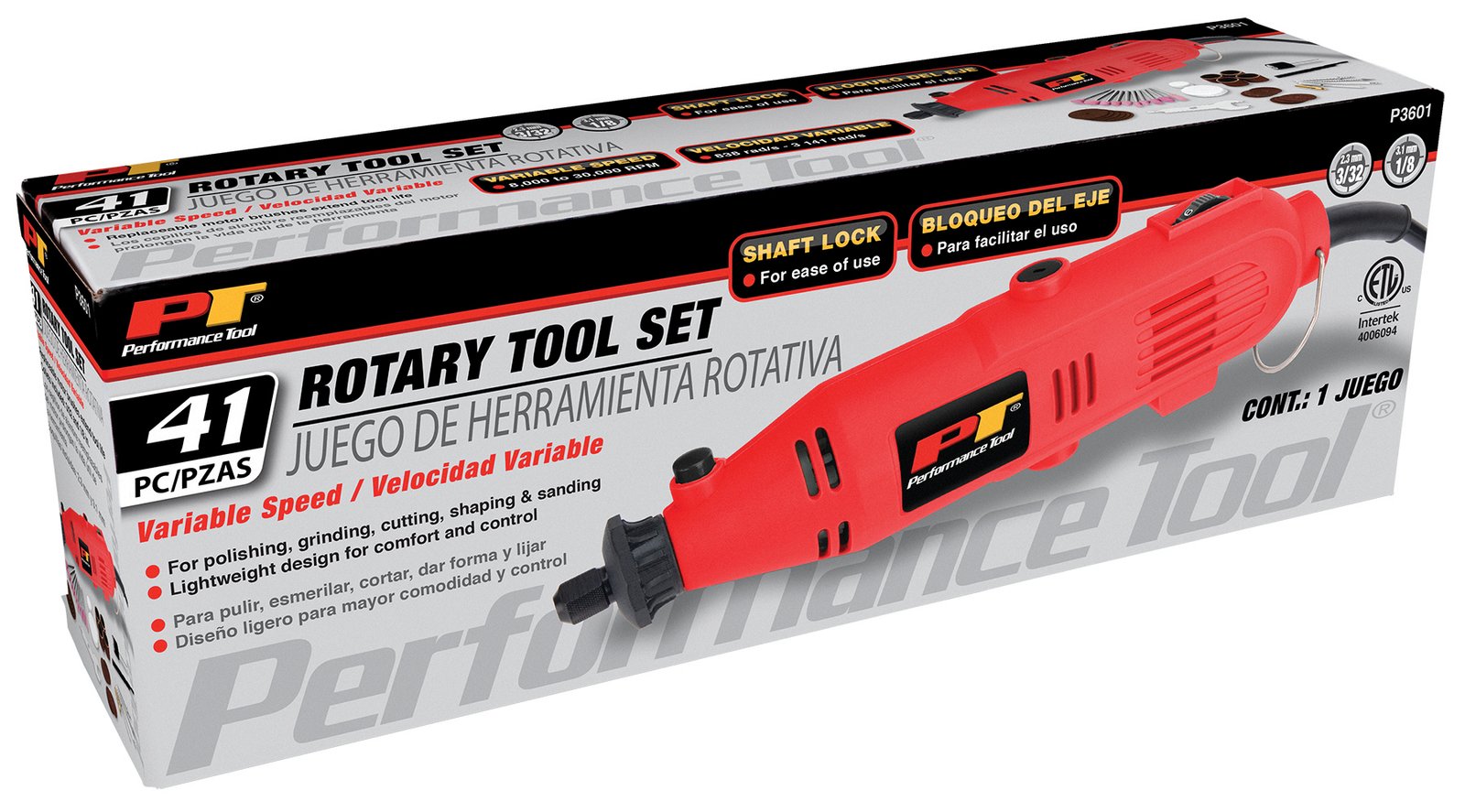
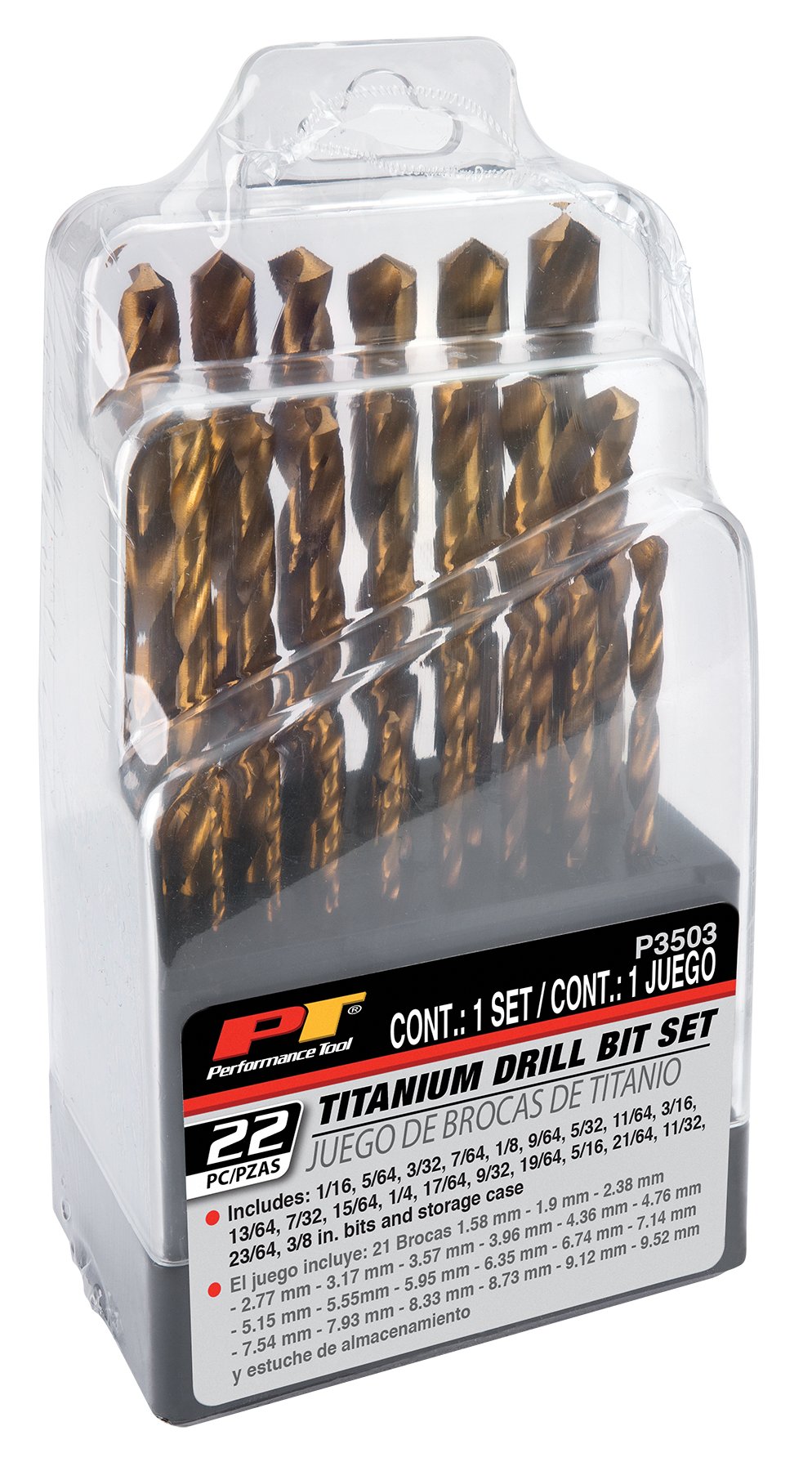
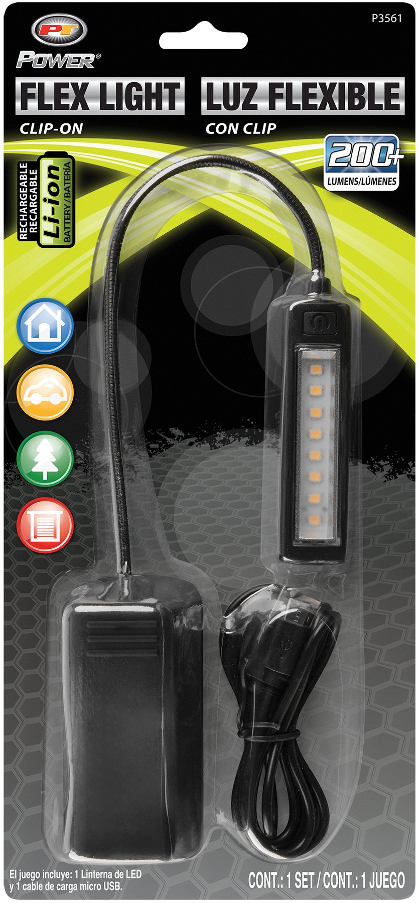
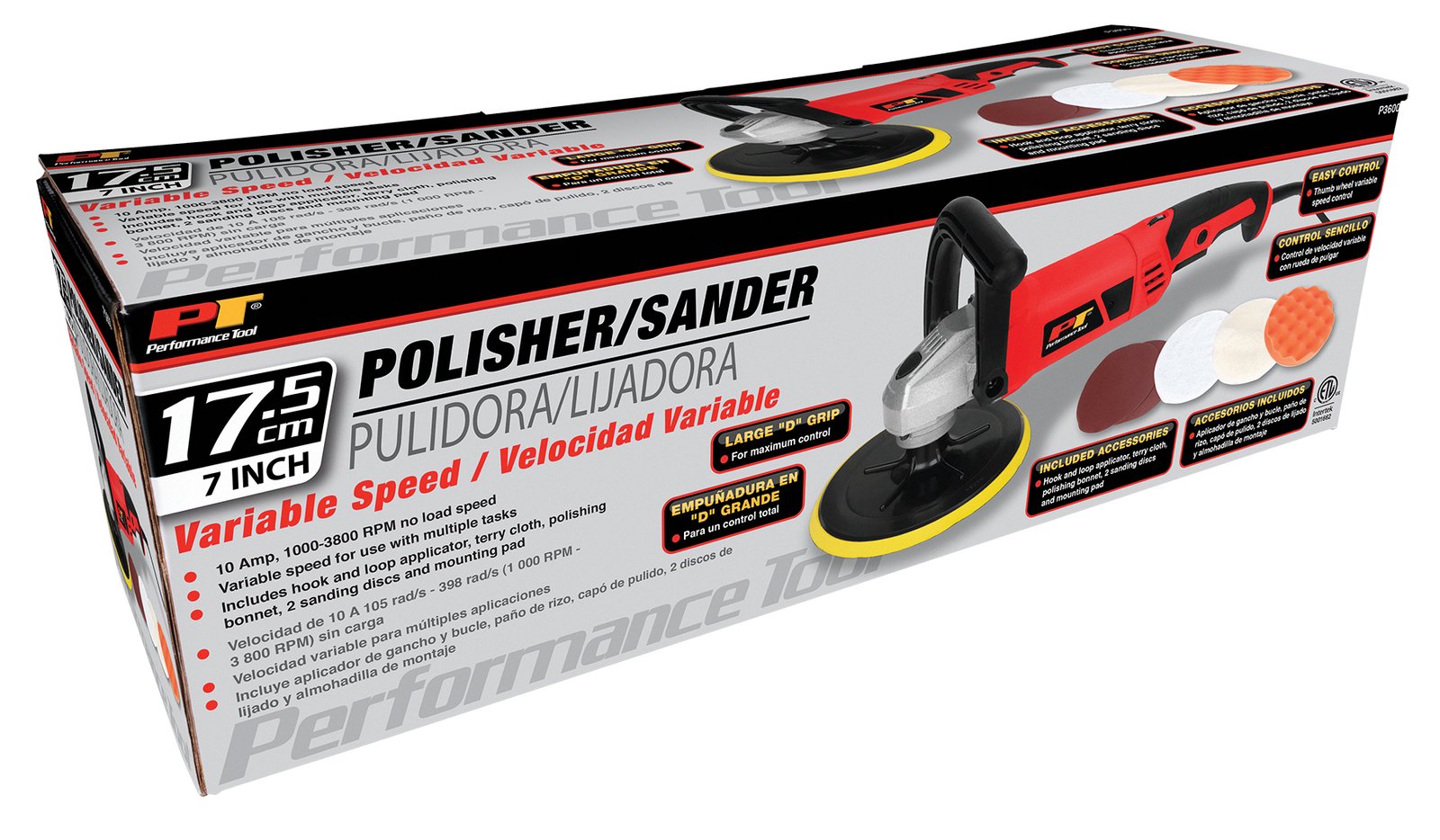
Utilizing a methodical approach, I engage in the design process of packaging materials with a focus on adhering to brand specifications and consumer preferences. I have worked on a variety of projects, including packaging for private label items and established national brands such as O’Reilly’s Auto Parts and AutoZone. By carefully following brand guidelines and integrating innovative elements into each design, I aim to enhance product visibility and appeal on store shelves. My contributions to crafting packaging solutions play a significant role in bolstering brand recognition and supporting sales objectives.


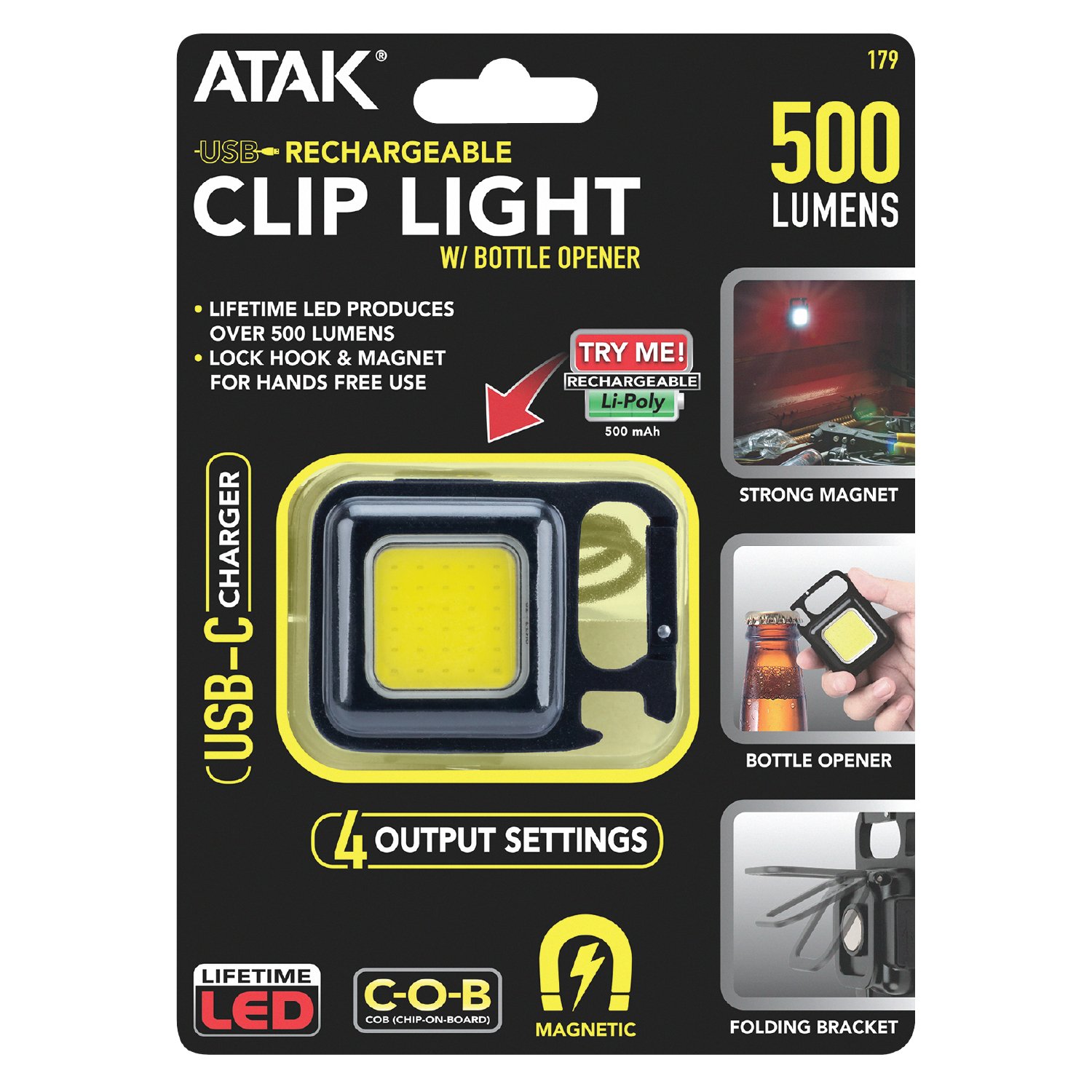
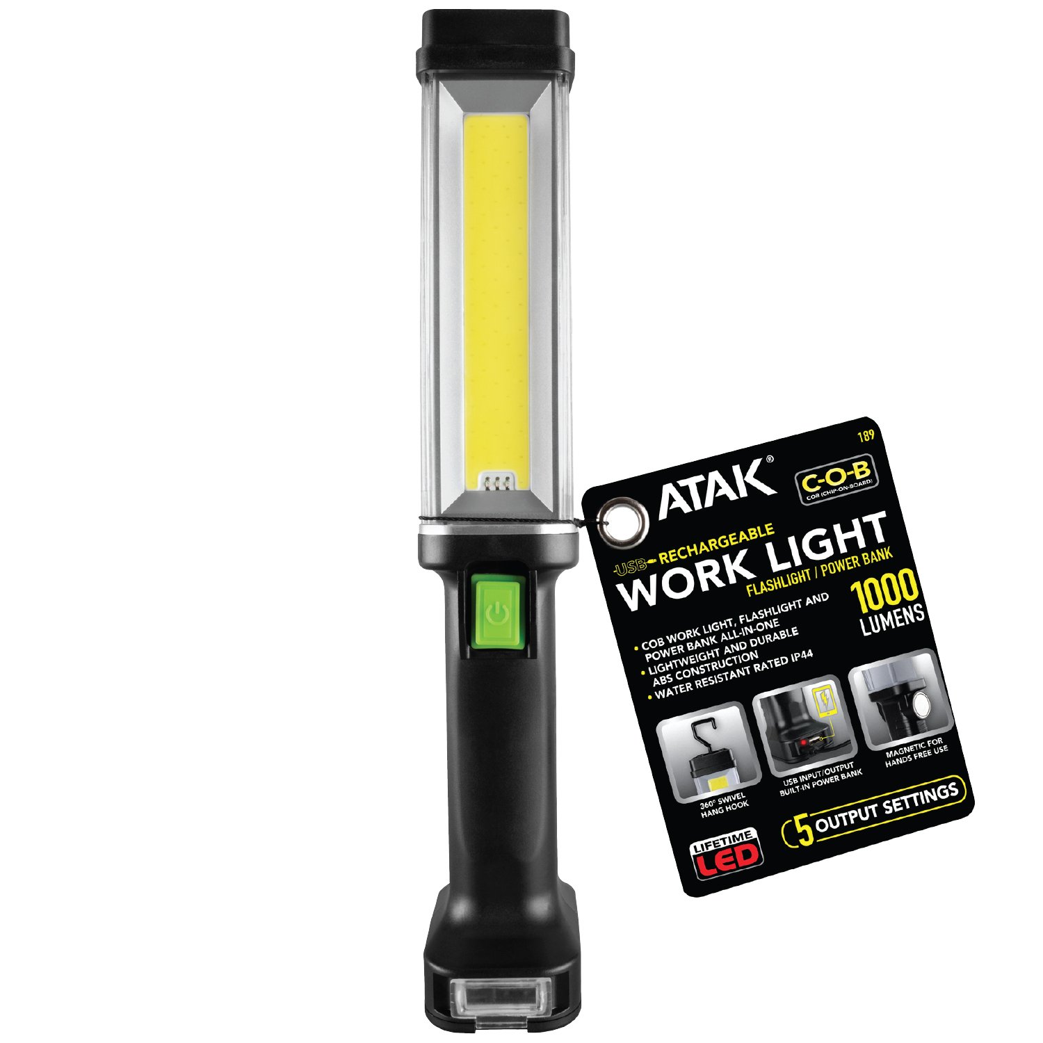
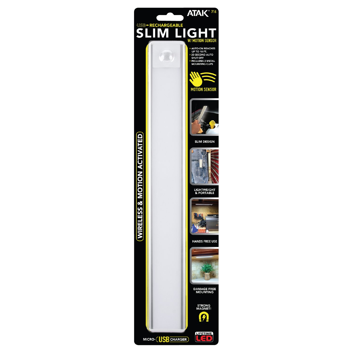
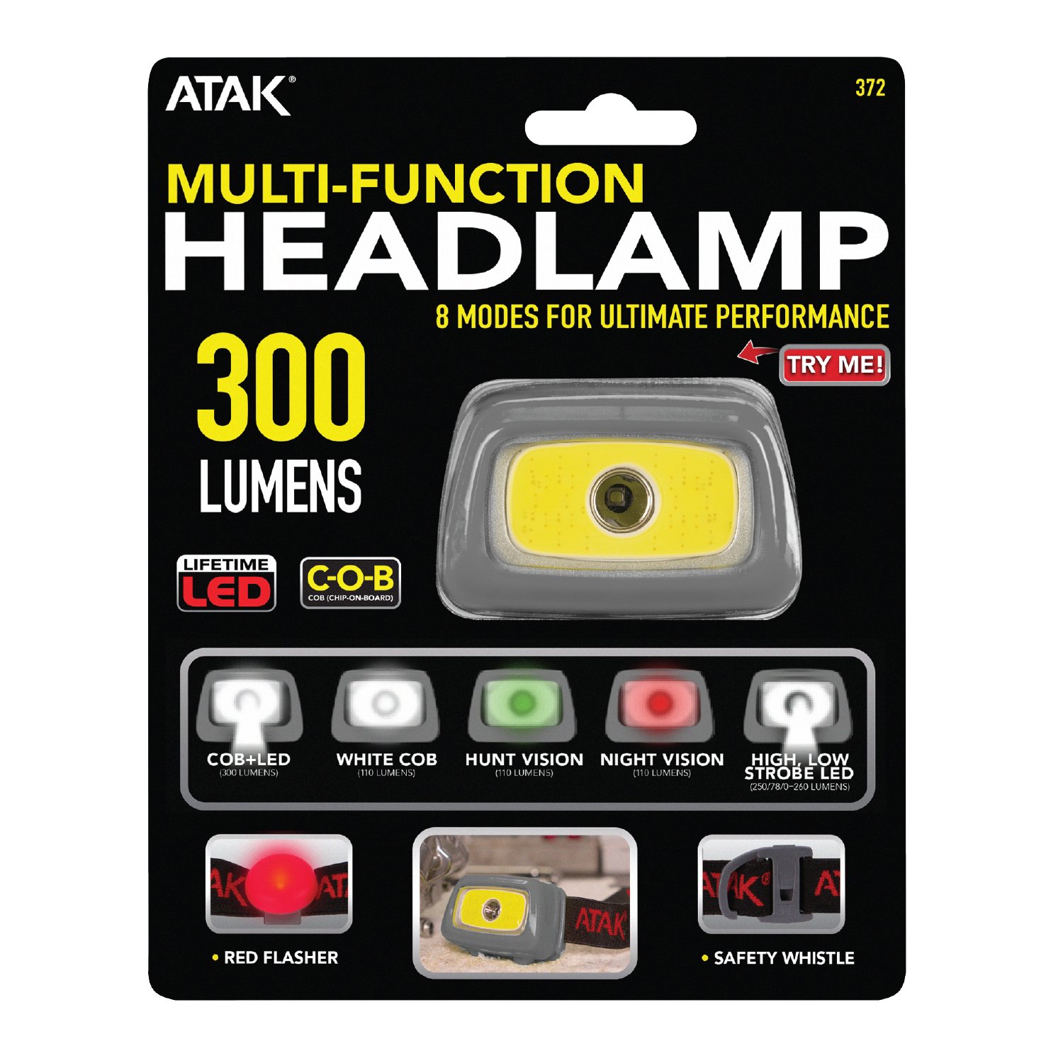
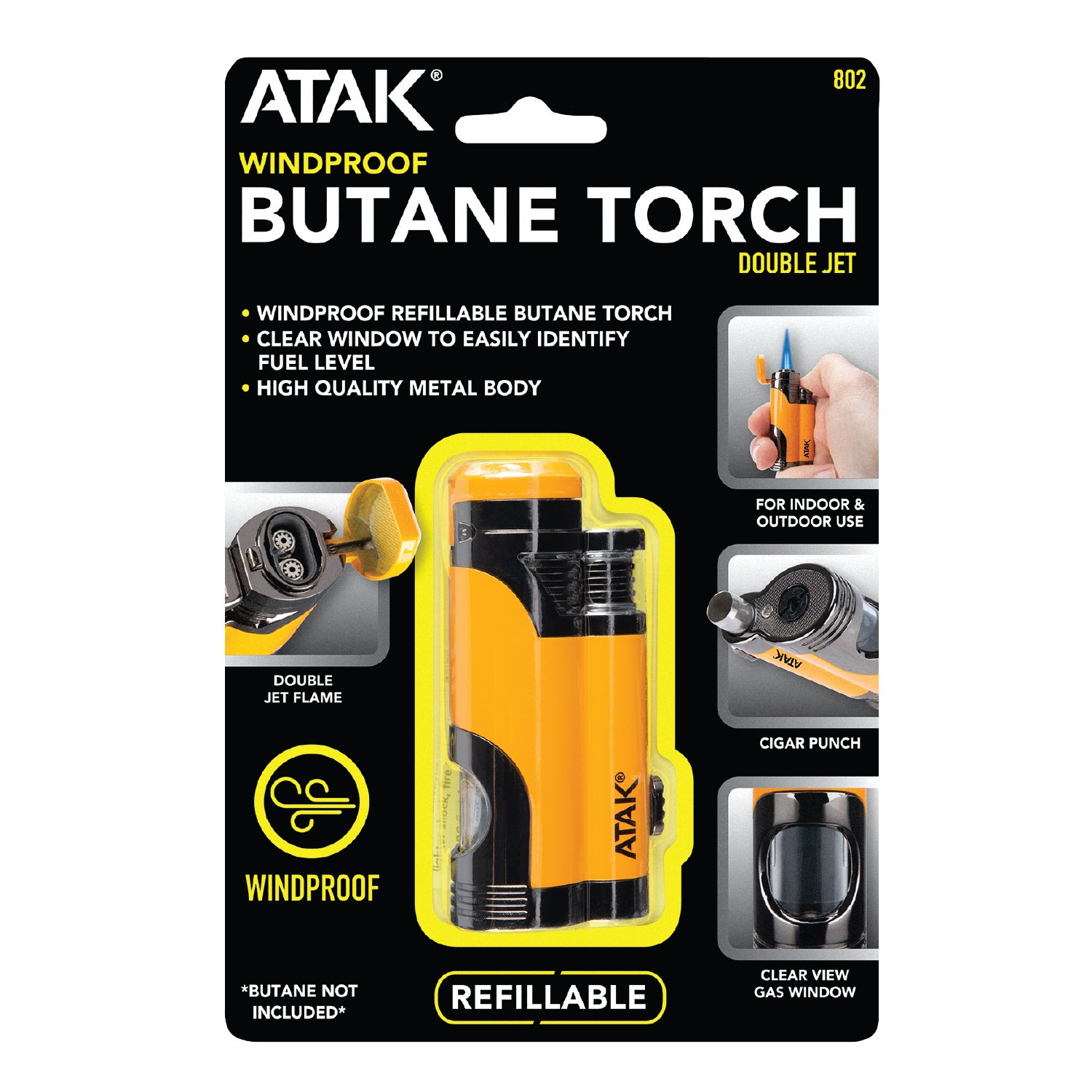
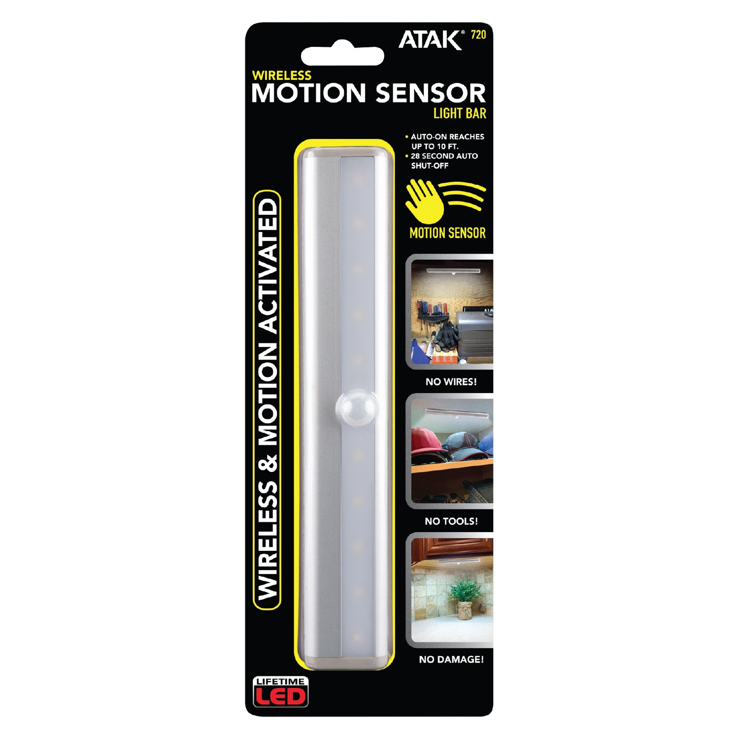
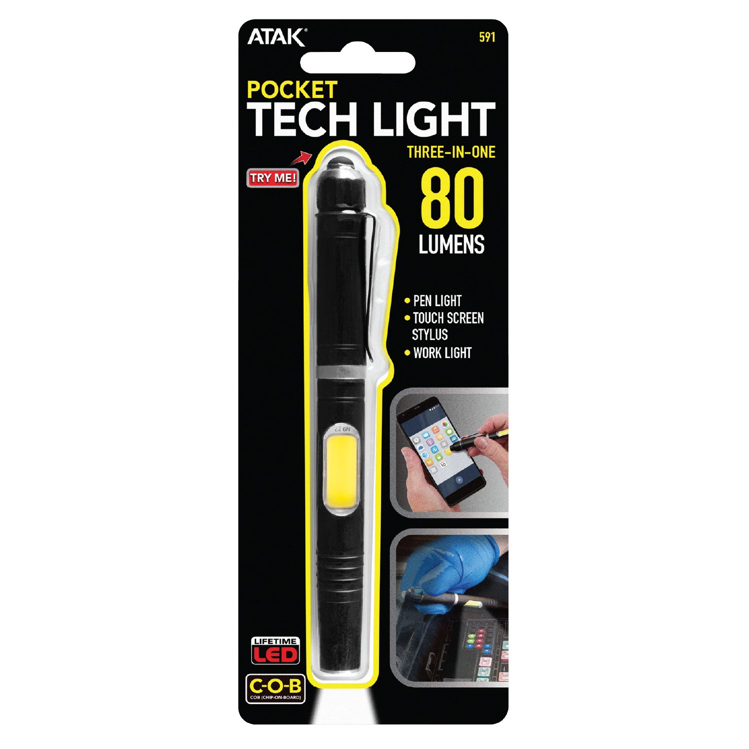
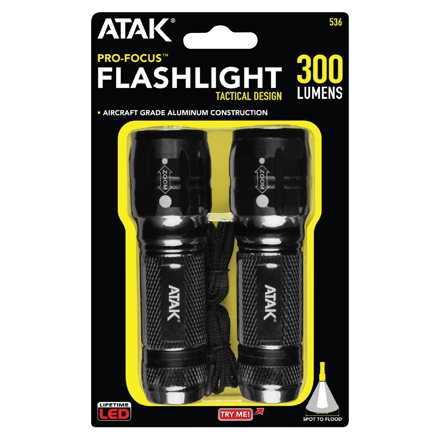
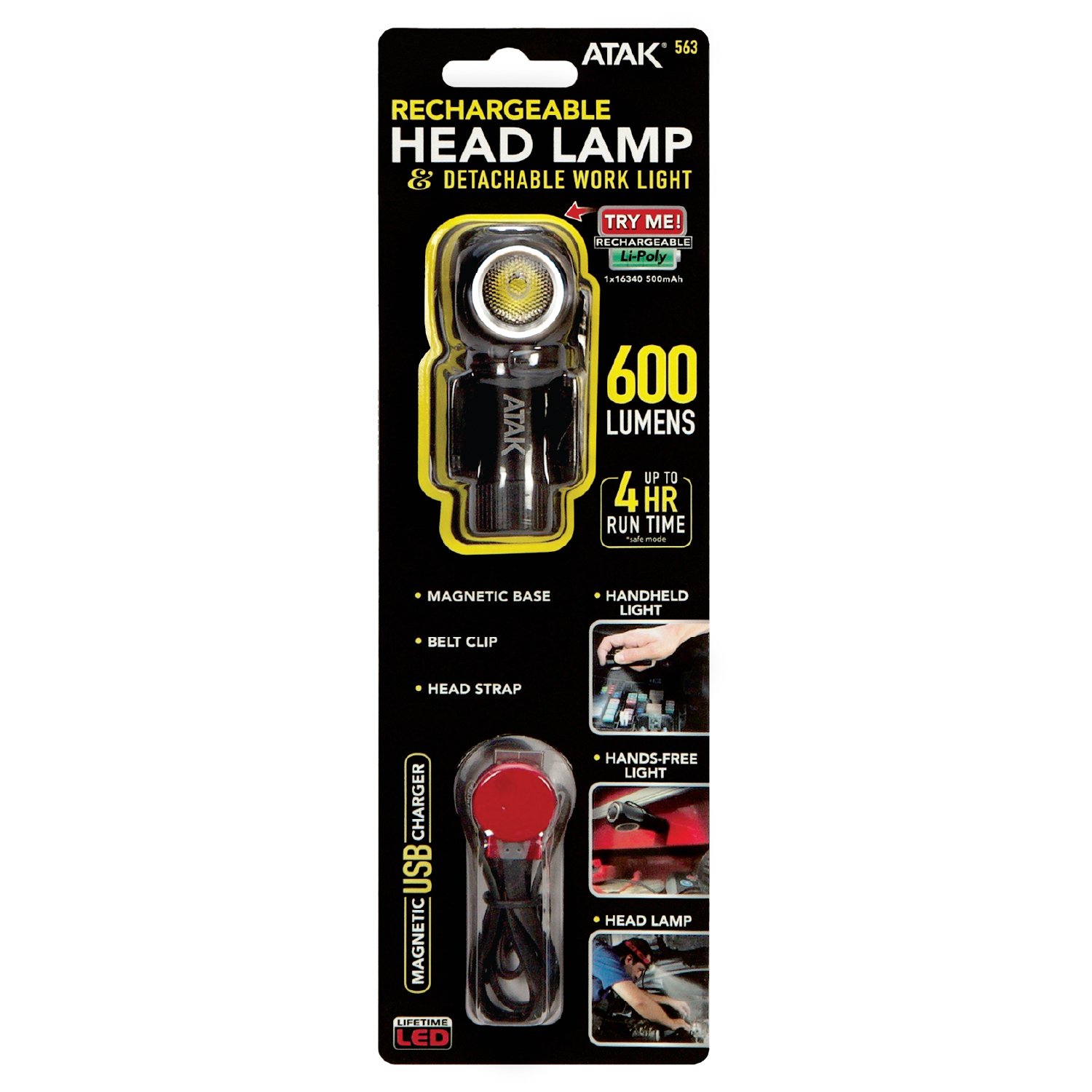
ATAK is a specialty lighting brand within Wilmar LLC’s portfolio, focused primarily on flashlights, work lights, inspection lights, and other portable lighting solutions designed for automotive, workshop, job-site, and everyday applications. The product line is built around practical, task-oriented lighting solutions for users who need dependable illumination in demanding environments.


My packaging work for ATAK involved developing retail packaging that clearly communicated each product’s lighting capabilities, features, applications, and technical specifications while maintaining a cohesive brand identity across a diverse product line. Because lighting products often compete on technical attributes such as brightness, beam performance, runtime, power source, and versatility, the packaging required a strong visual hierarchy that allowed customers to quickly understand the product and its advantages.
 

The work included adapting the visual system across different packaging formats and product categories, balancing technical information with strong product presentation and retail impact. The result was packaging designed to make highly functional lighting products easy to understand while establishing a consistent and recognizable ATAK presence across the line.

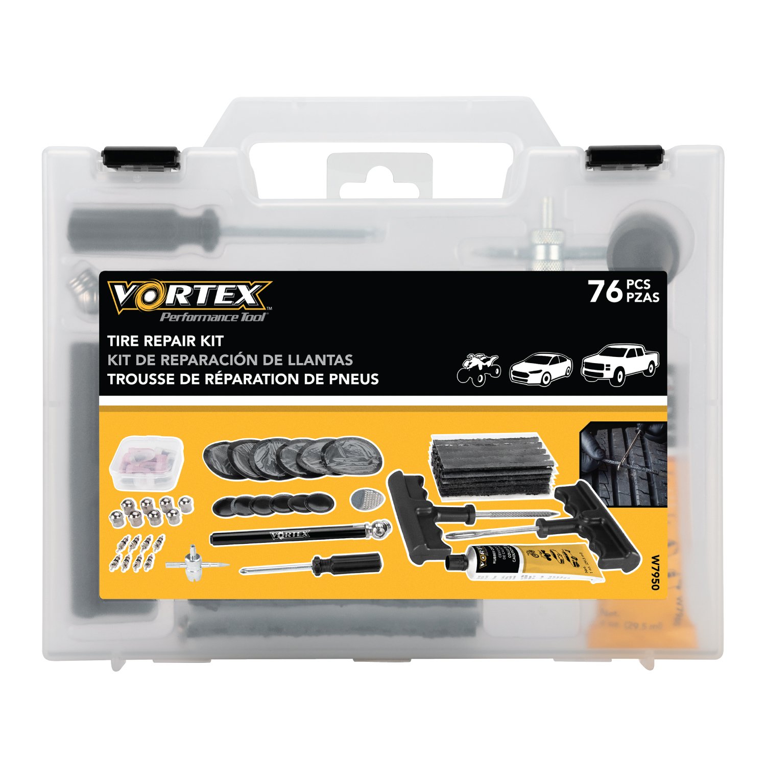
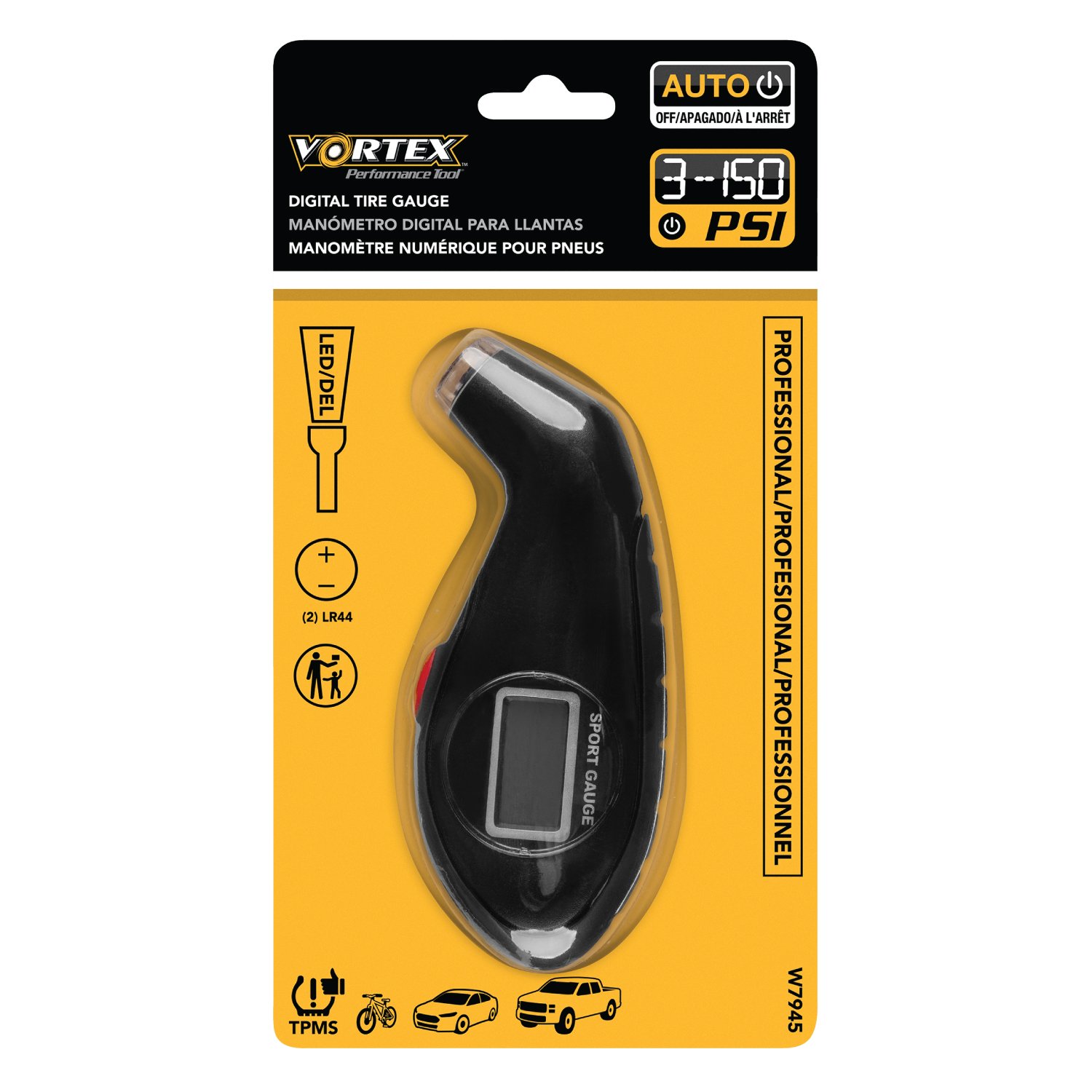
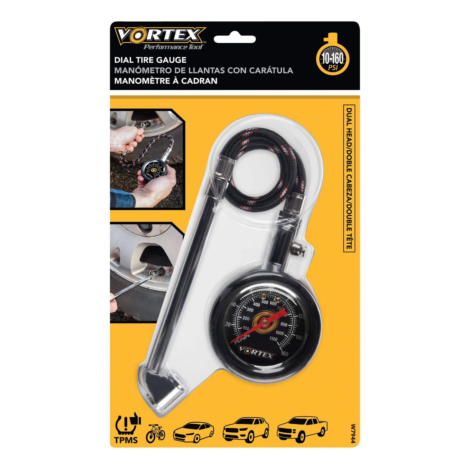
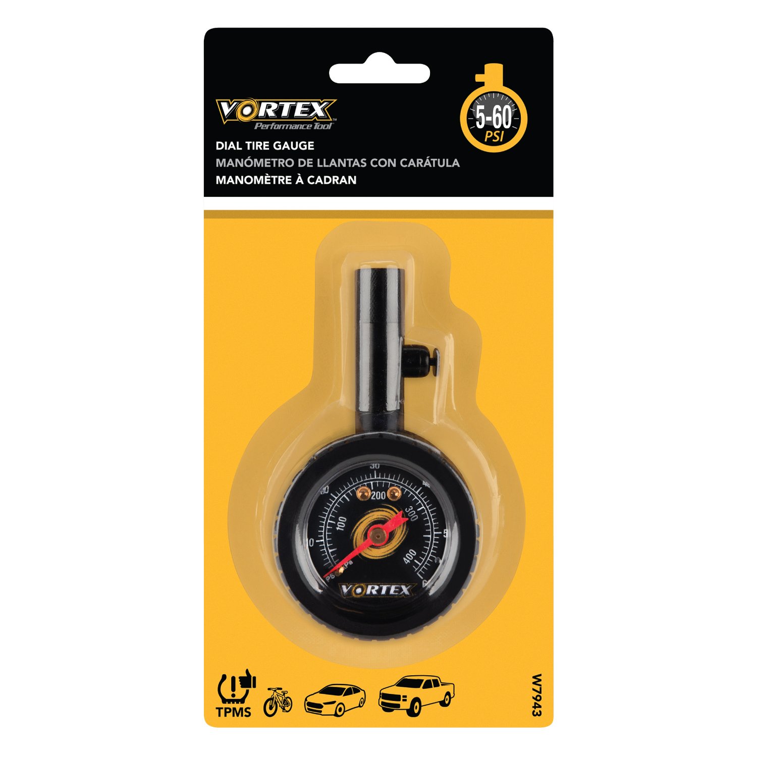
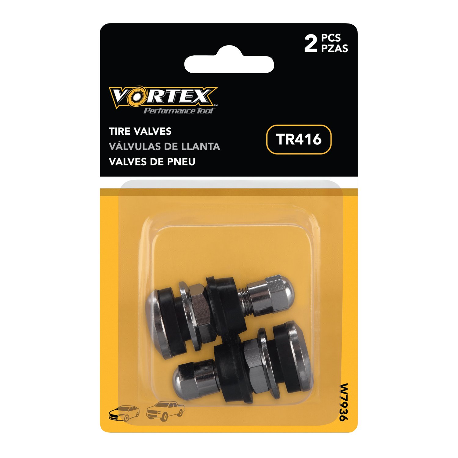
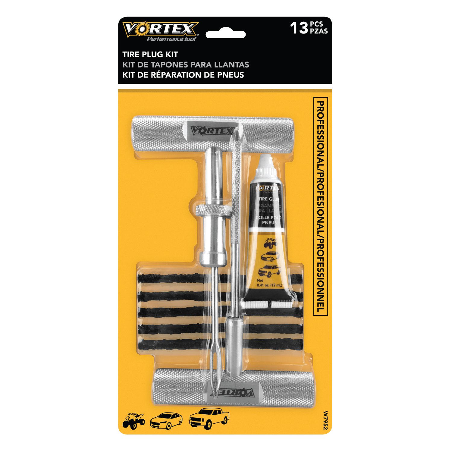
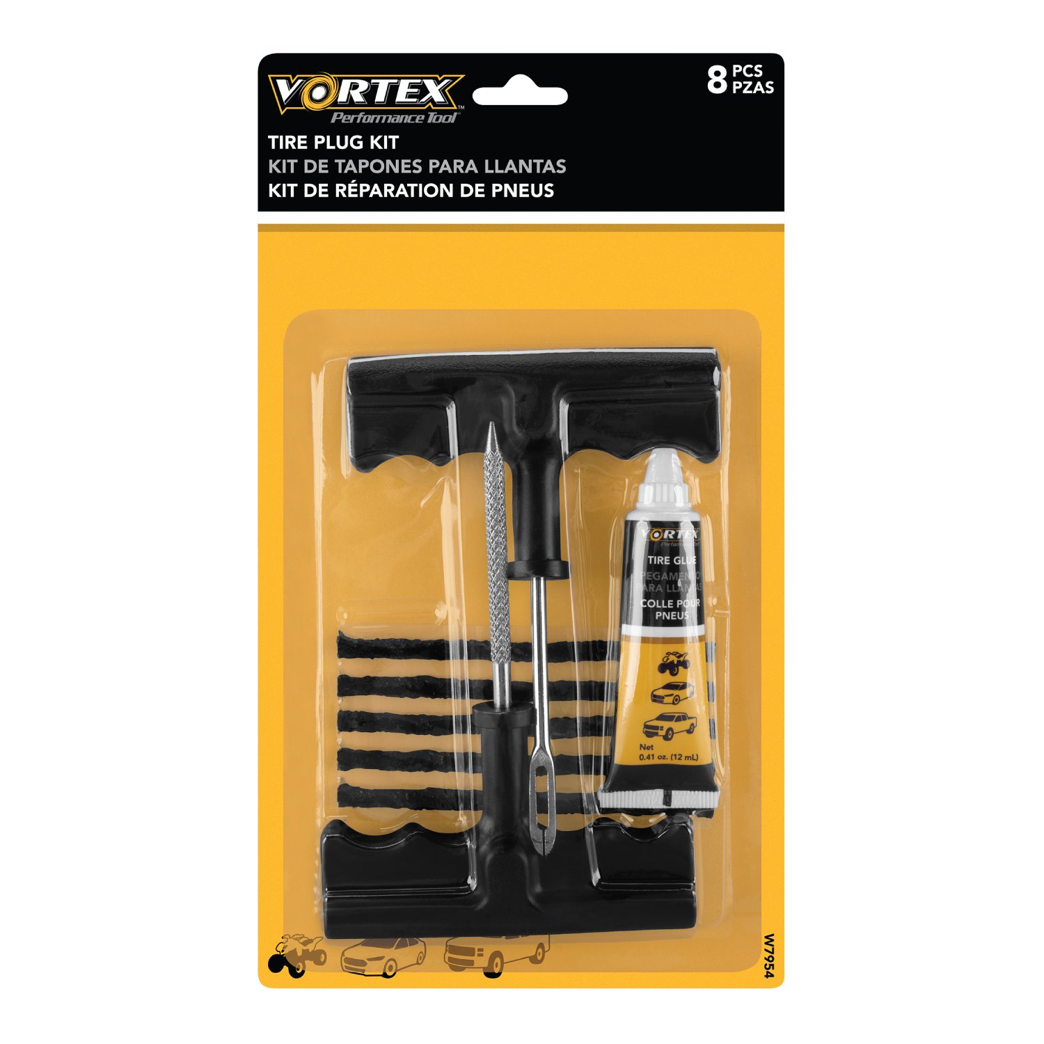
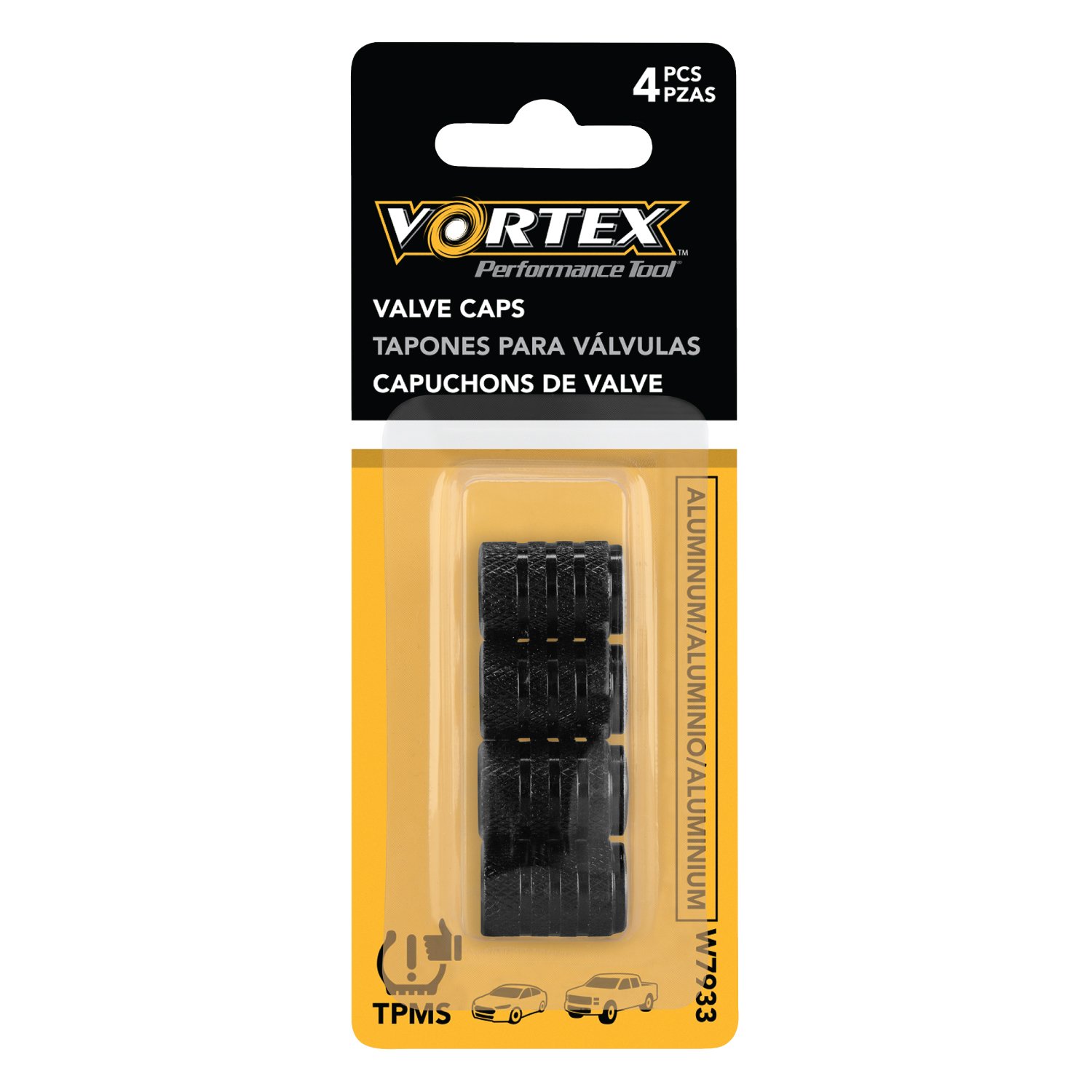
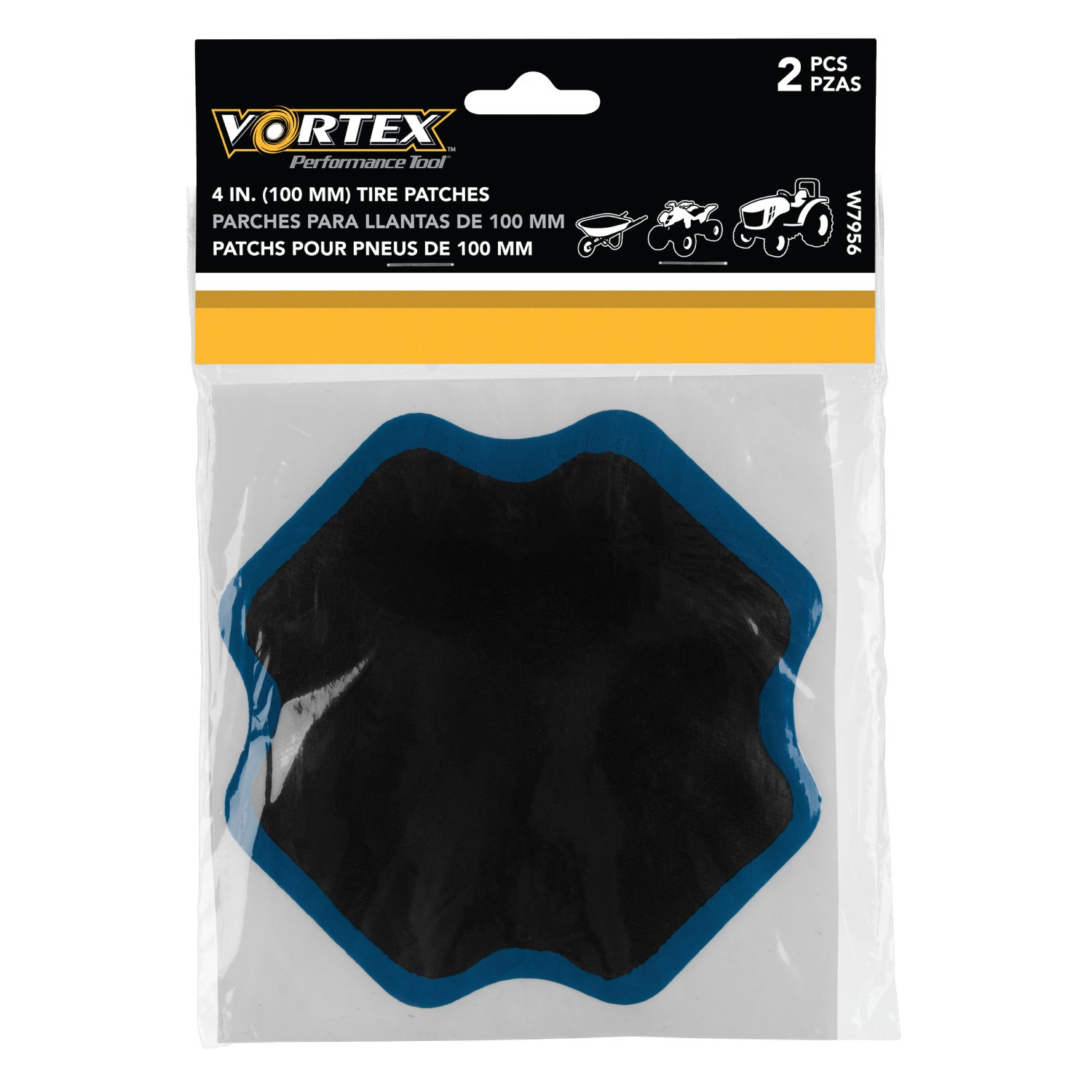
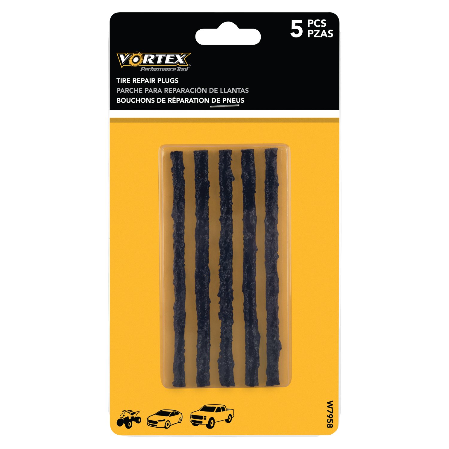
Vortex is a specialized tire-inflation brand from Performance Tool, focused on portable compressors and tire-service solutions for automotive maintenance, roadside emergencies, and everyday vehicle care. The product line includes compact and rapid tire inflators, digital auto-shutoff models, AC/DC-powered compressors, and versatile inflators designed for both vehicle tires and larger inflatables.
 

My packaging work for Vortex involved presenting a highly technical product line in a way that was immediately understandable and compelling in a retail environment. The packaging needed to communicate performance specifications such as maximum PSI, inflation speed, power source, gauge type, hose length, and key technologies while clearly differentiating the capabilities of each model.
 

The work required developing a cohesive packaging system across multiple product configurations while emphasizing the performance-driven nature of the Vortex brand. Features such as upgraded metal pump cylinders for improved heat dissipation and service life, digital pressure gauges, automatic shut-off, high-pressure braided hoses, and integrated LED lighting provided important opportunities to translate technical engineering into clear visual selling points.

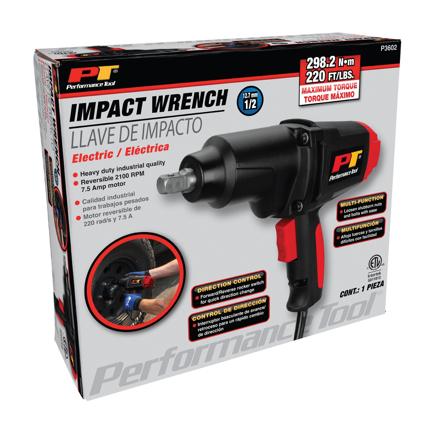
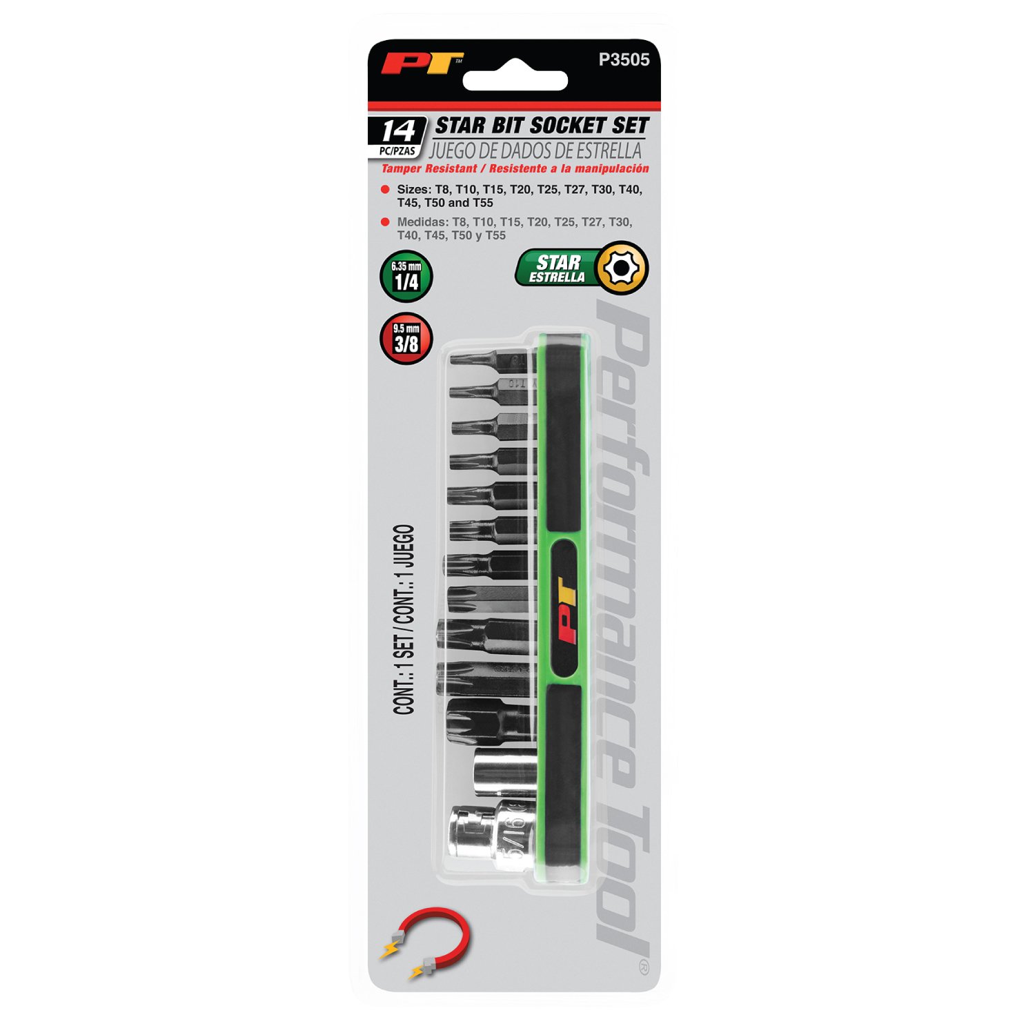
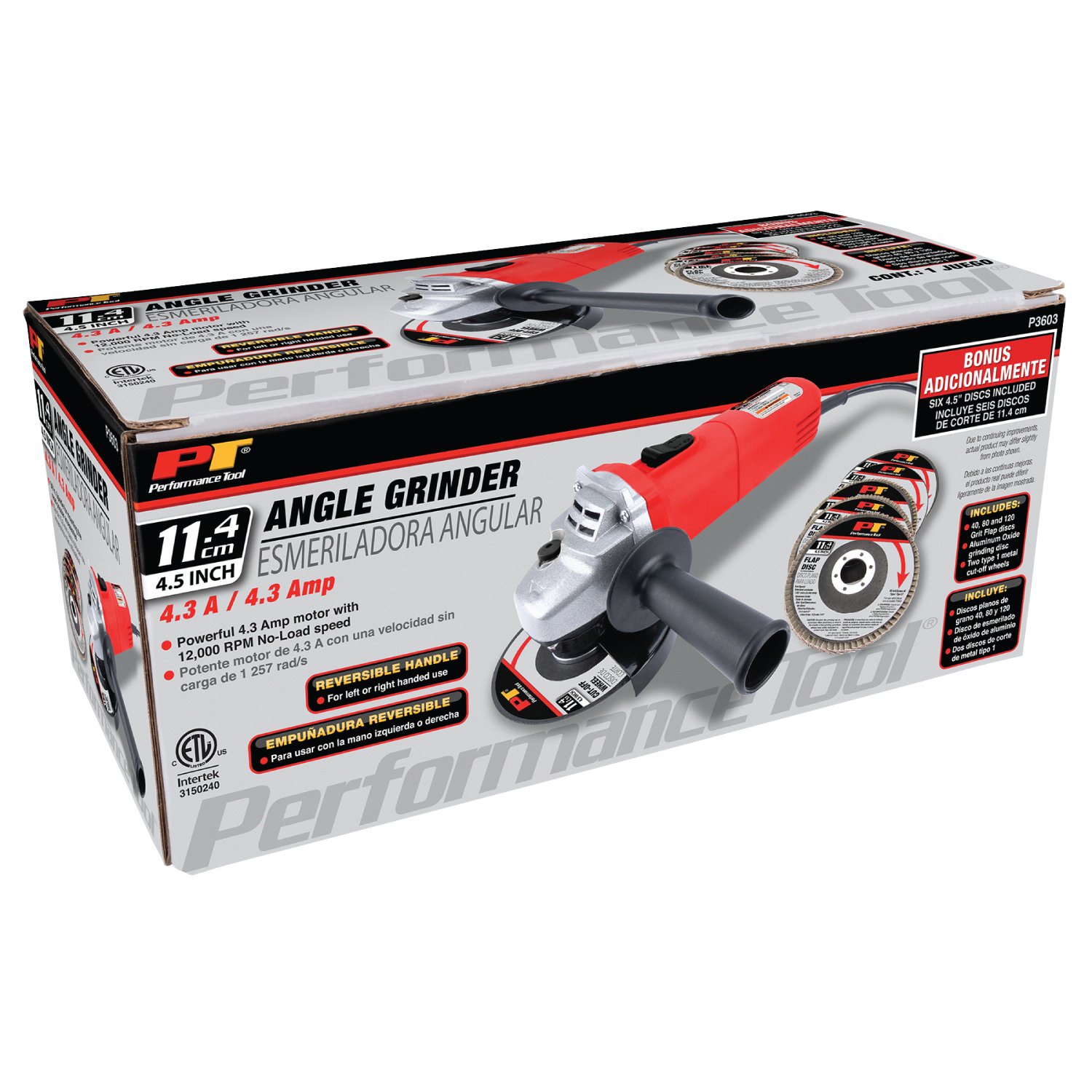
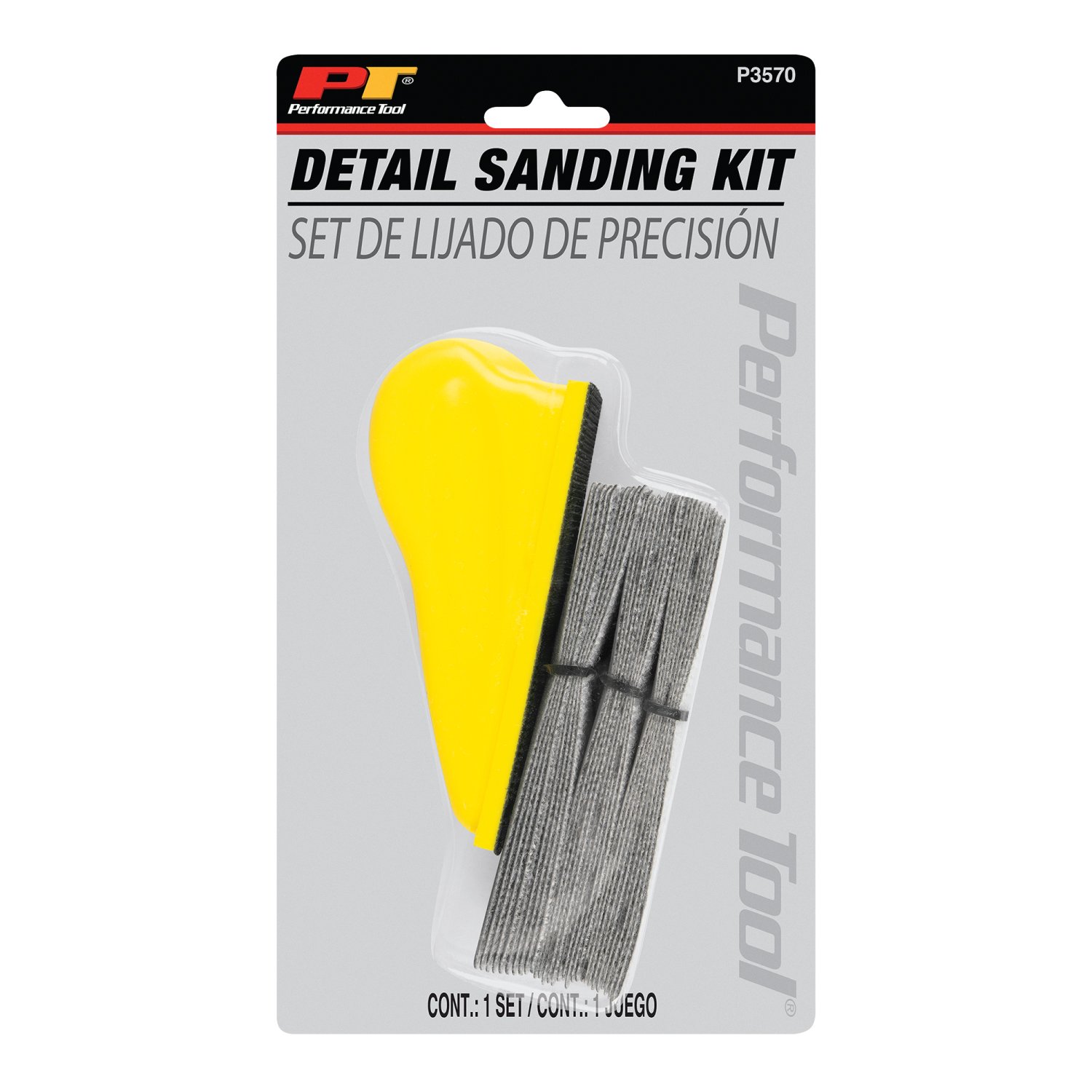
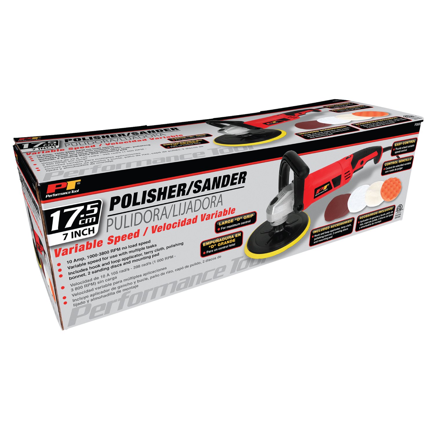
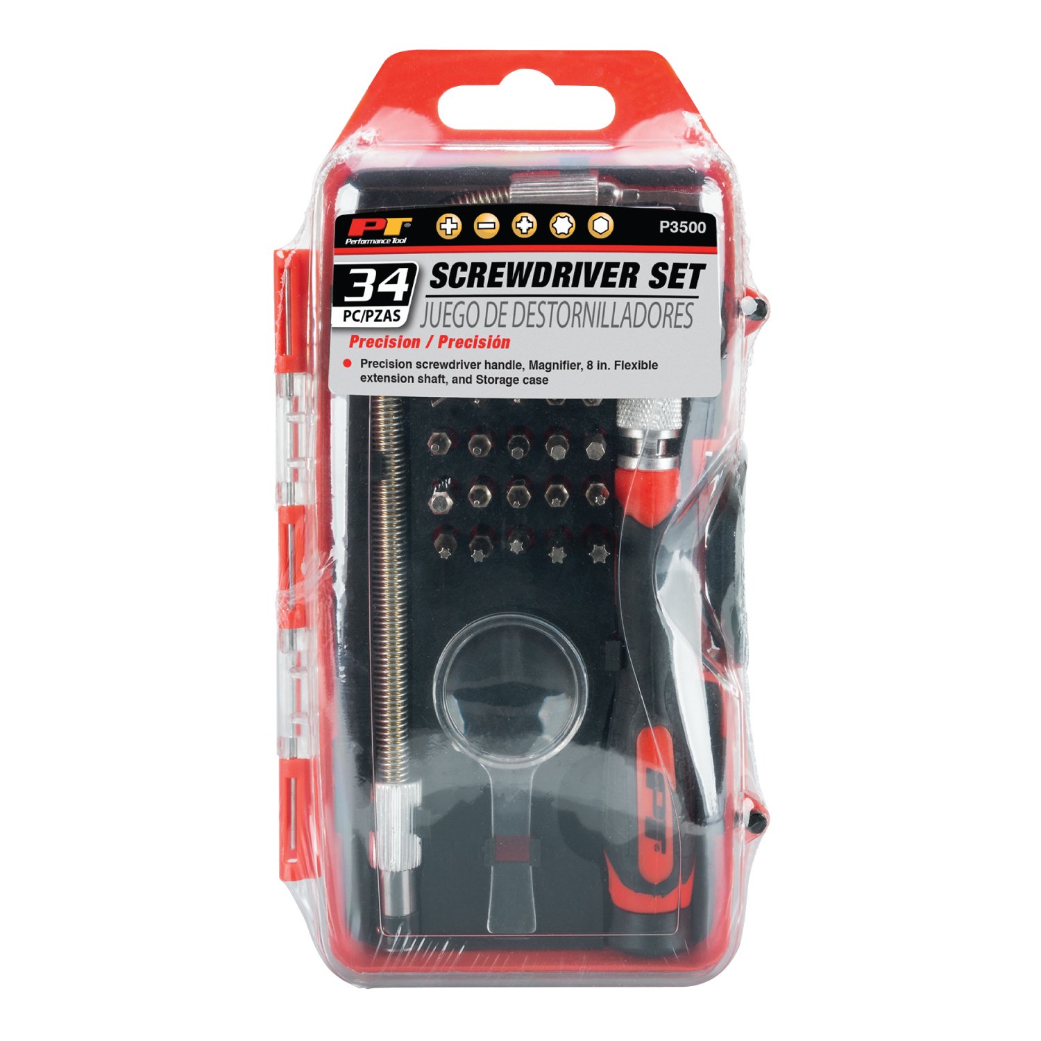
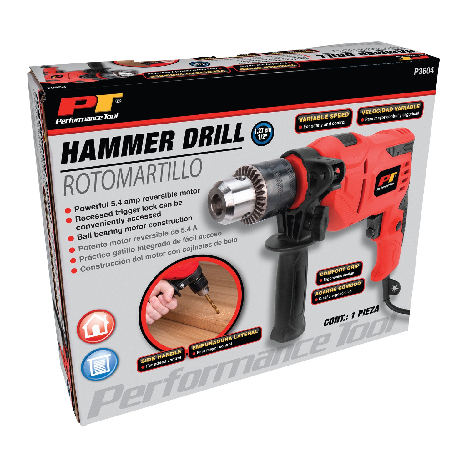
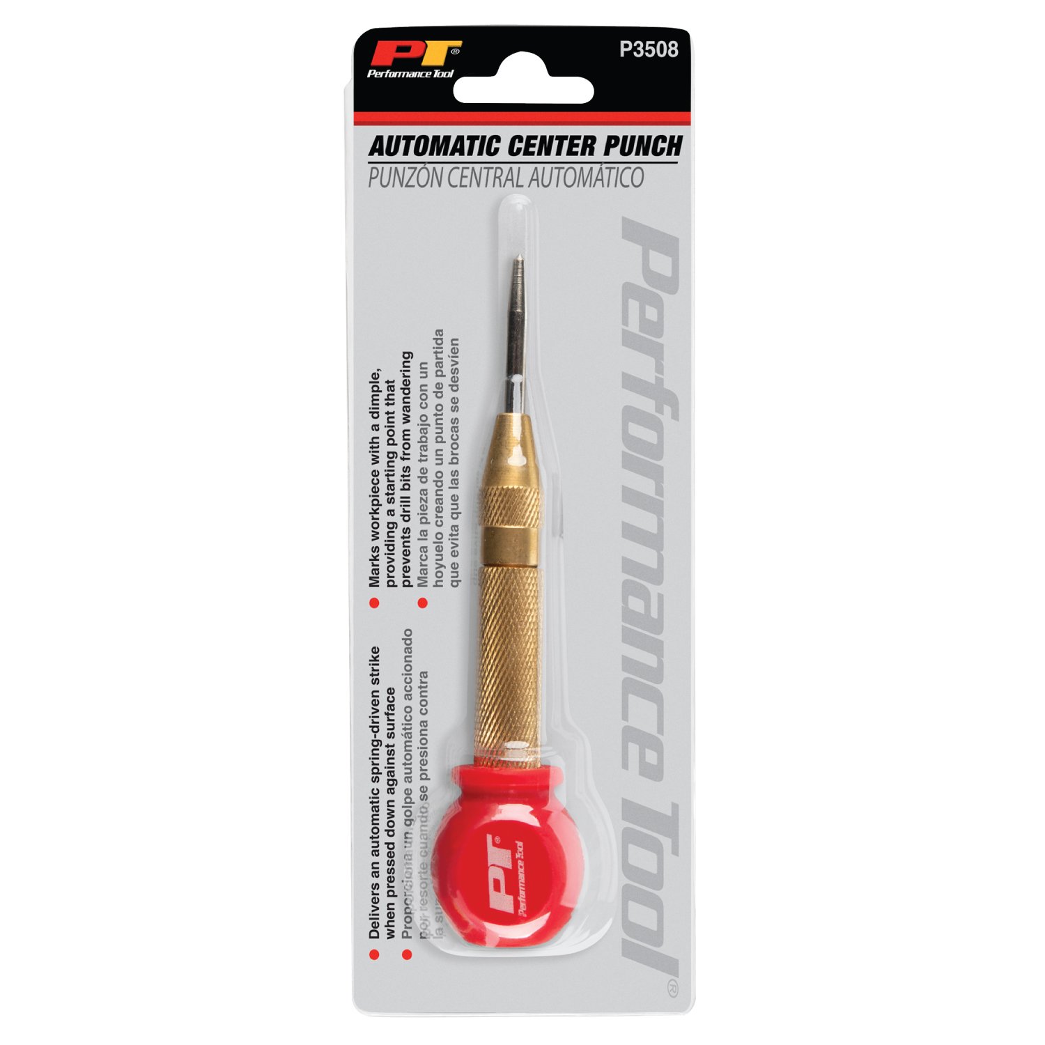
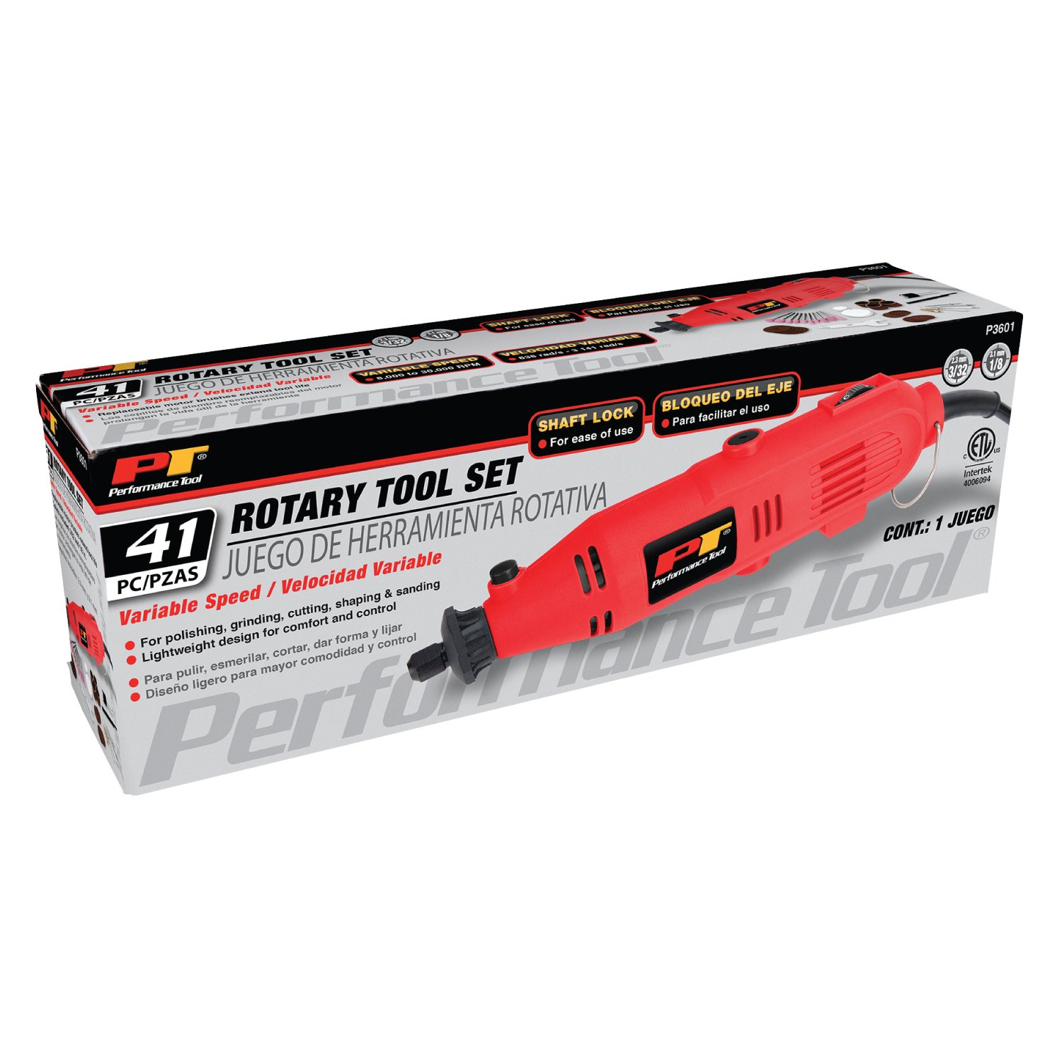
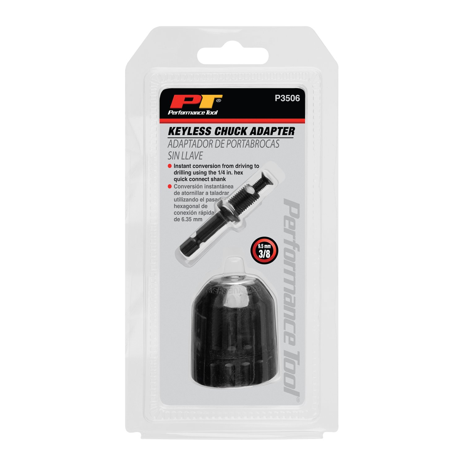
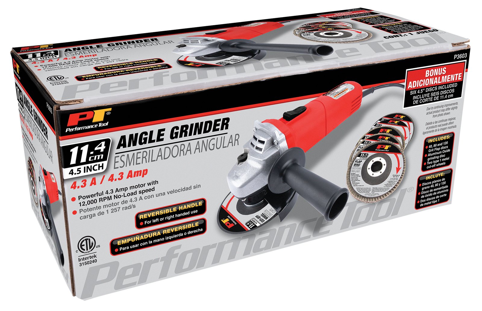
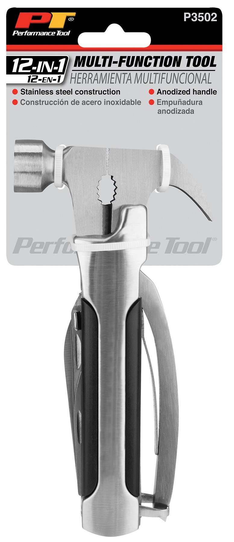
Performance Tool is an established automotive and hand-tool brand with a broad product portfolio serving professional mechanics, tradespeople, and DIY consumers. Distributed through major retail channels and international markets, the brand encompasses a wide range of automotive tools, shop equipment, specialty tools, and accessories designed for demanding applications.


The brand’s extensive product range requires packaging that communicates product functionality, specifications, and value clearly while maintaining a consistent and recognizable visual identity across hundreds of products. This project involved developing packaging within that established brand system, balancing technical product information with strong visual presentation and retail appeal.


The portfolio includes bilingual packaging developed specifically for AutoZone Mexico, demonstrating the additional considerations involved in adapting product communication and packaging for international retail markets.

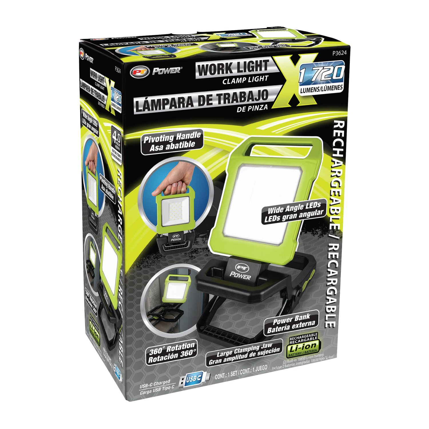
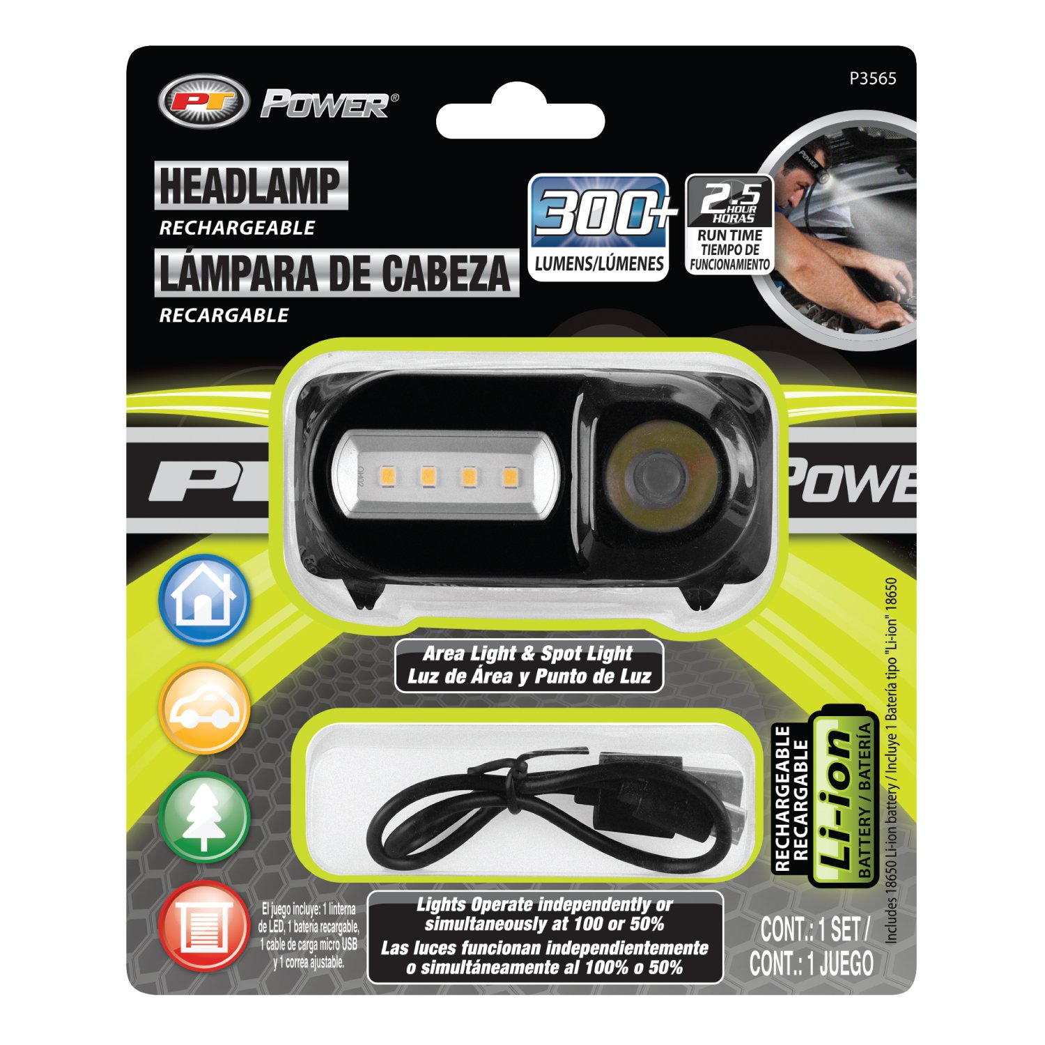
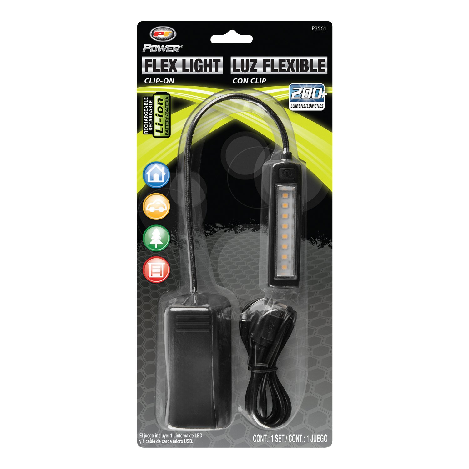
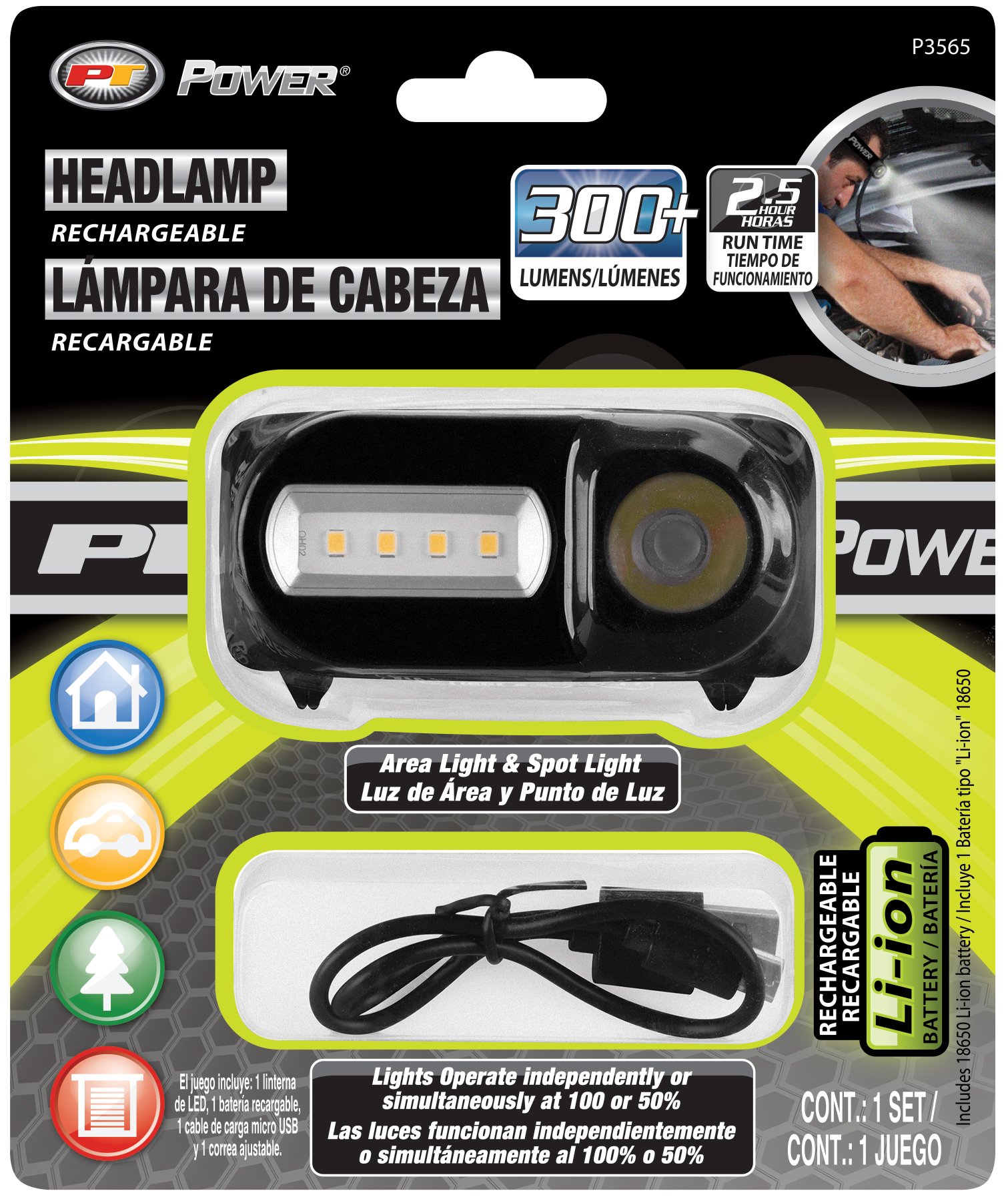
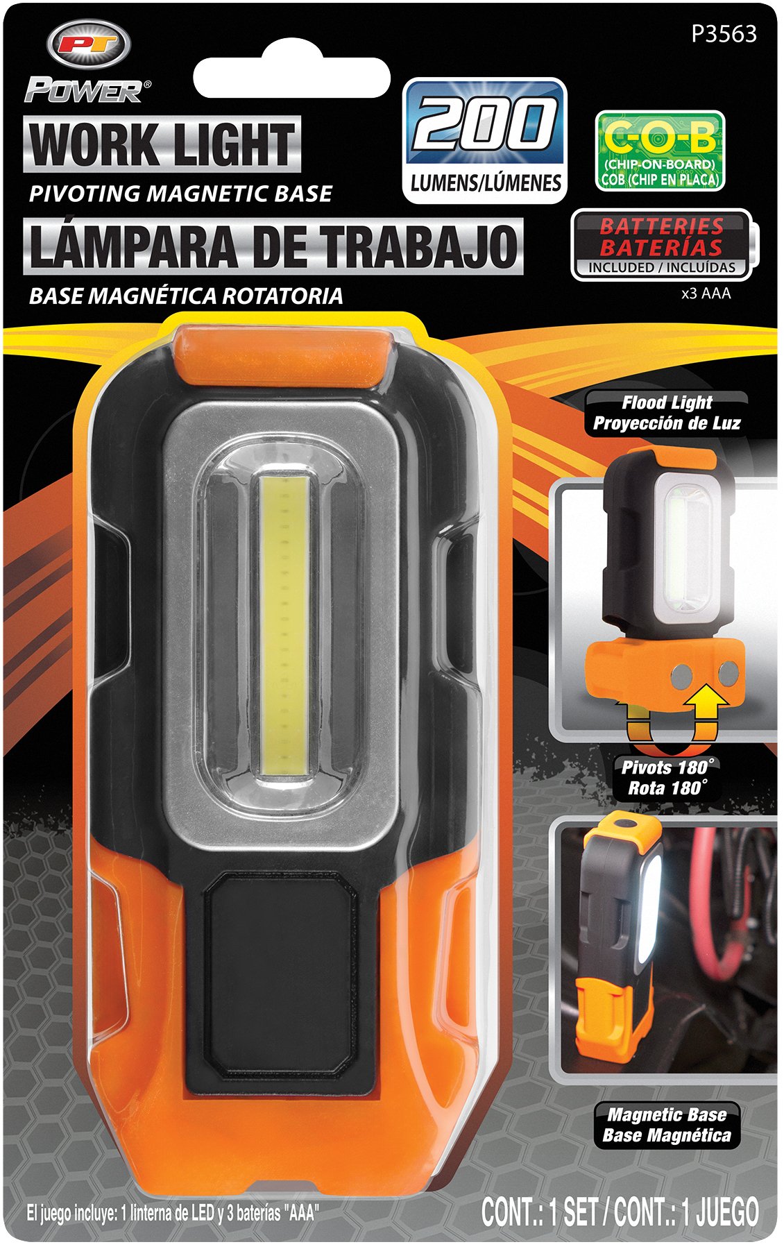
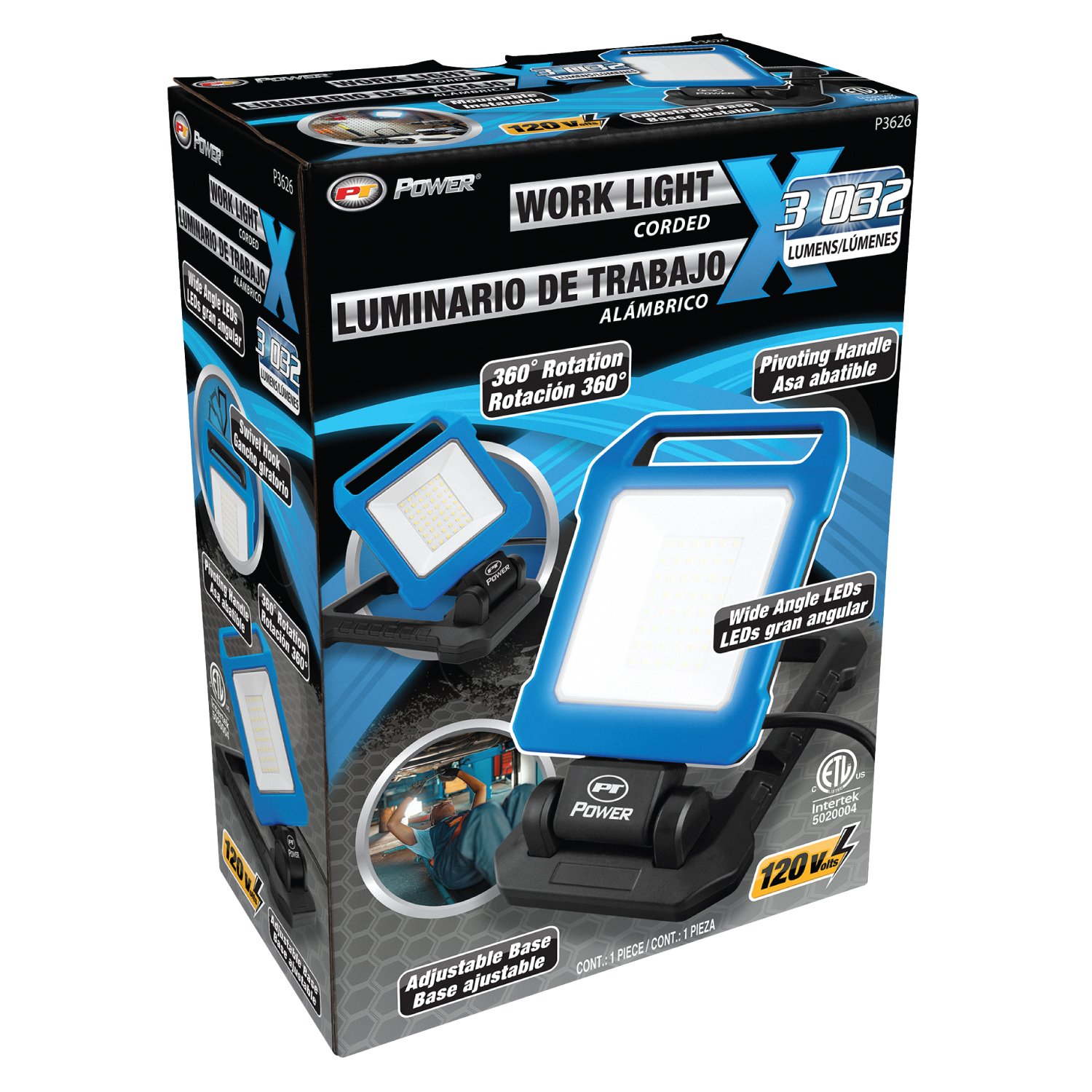
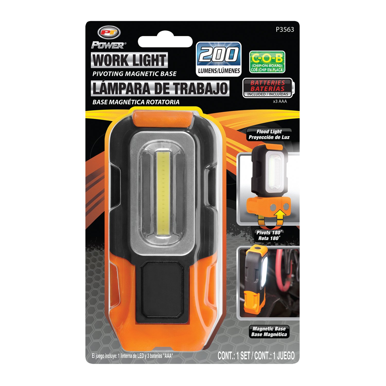
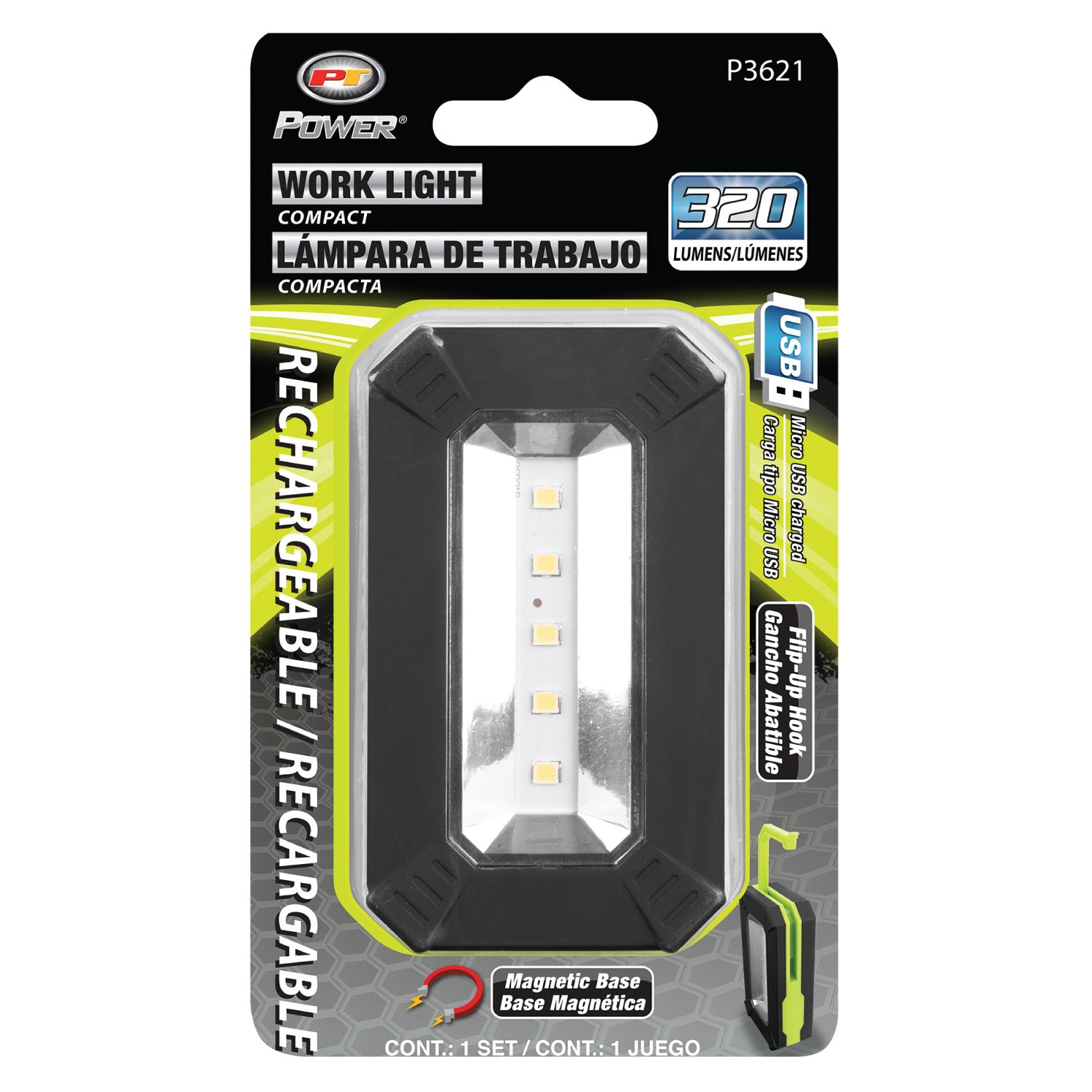
PT Power is a lighting-focused brand within Wilmar LLC’s Performance Tool portfolio, offering a broad range of portable and task-oriented illumination products. The line includes flashlights, headlamps, penlights, work lights, underhood lights, and specialized Firepoint X lighting designed for automotive, workshop, job-site, and everyday applications.


My packaging work for PT Power involved translating a wide range of technical lighting products into clear, visually engaging retail packaging. The designs needed to communicate key performance specifications—including lumen output, beam distance, runtime, power source, charging capabilities, and product-specific functionality—while making each product immediately understandable to customers at retail.


Working across the PT Power line required developing packaging that could accommodate products ranging from compact pocket lights and penlights to larger work and underhood lighting systems, while maintaining a consistent visual identity across the brand. The work balanced technical product information with strong product presentation, feature callouts, and retail impact, helping differentiate individual products while reinforcing PT Power as a cohesive lighting brand.

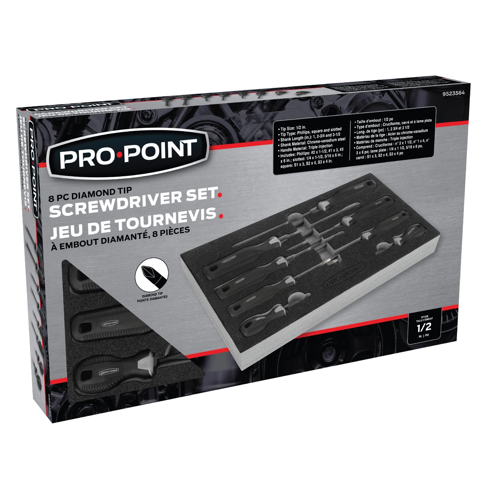
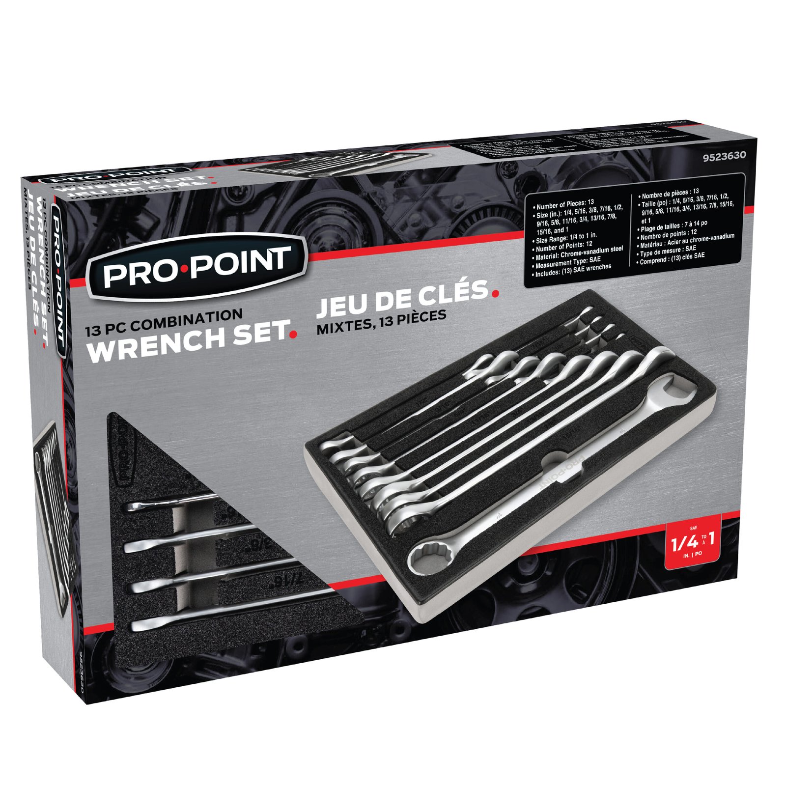
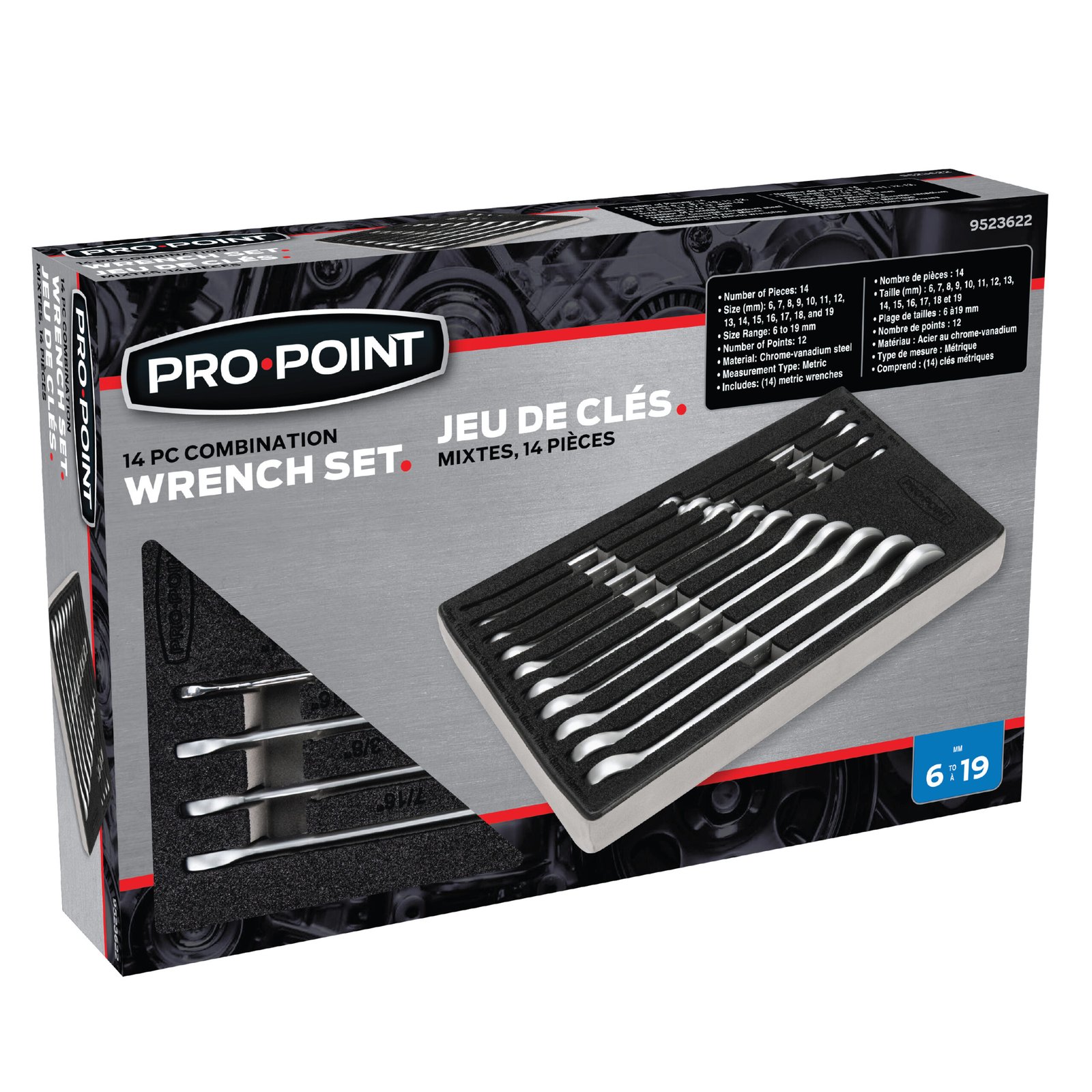
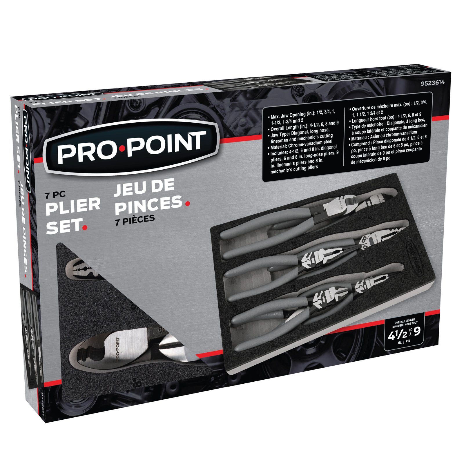
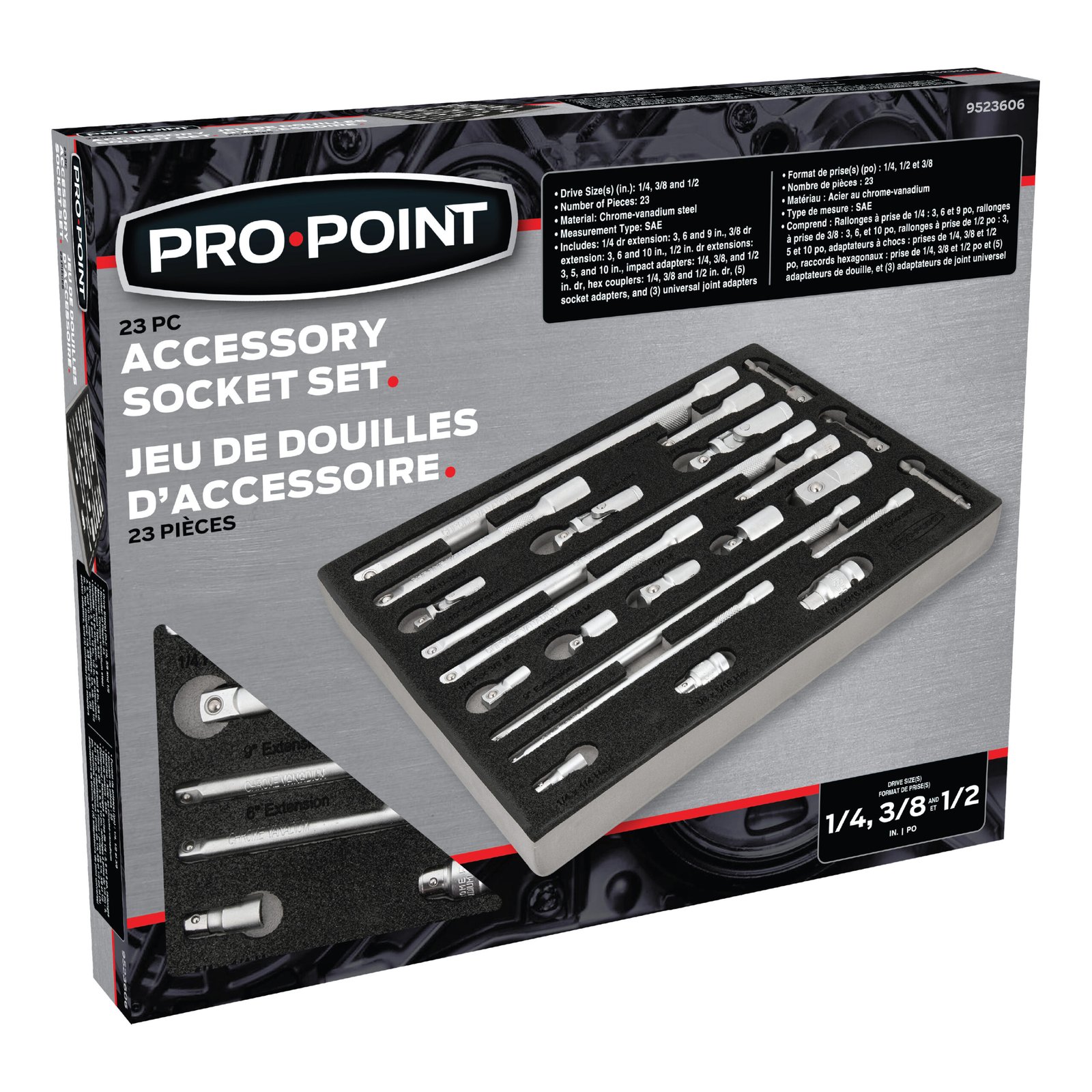
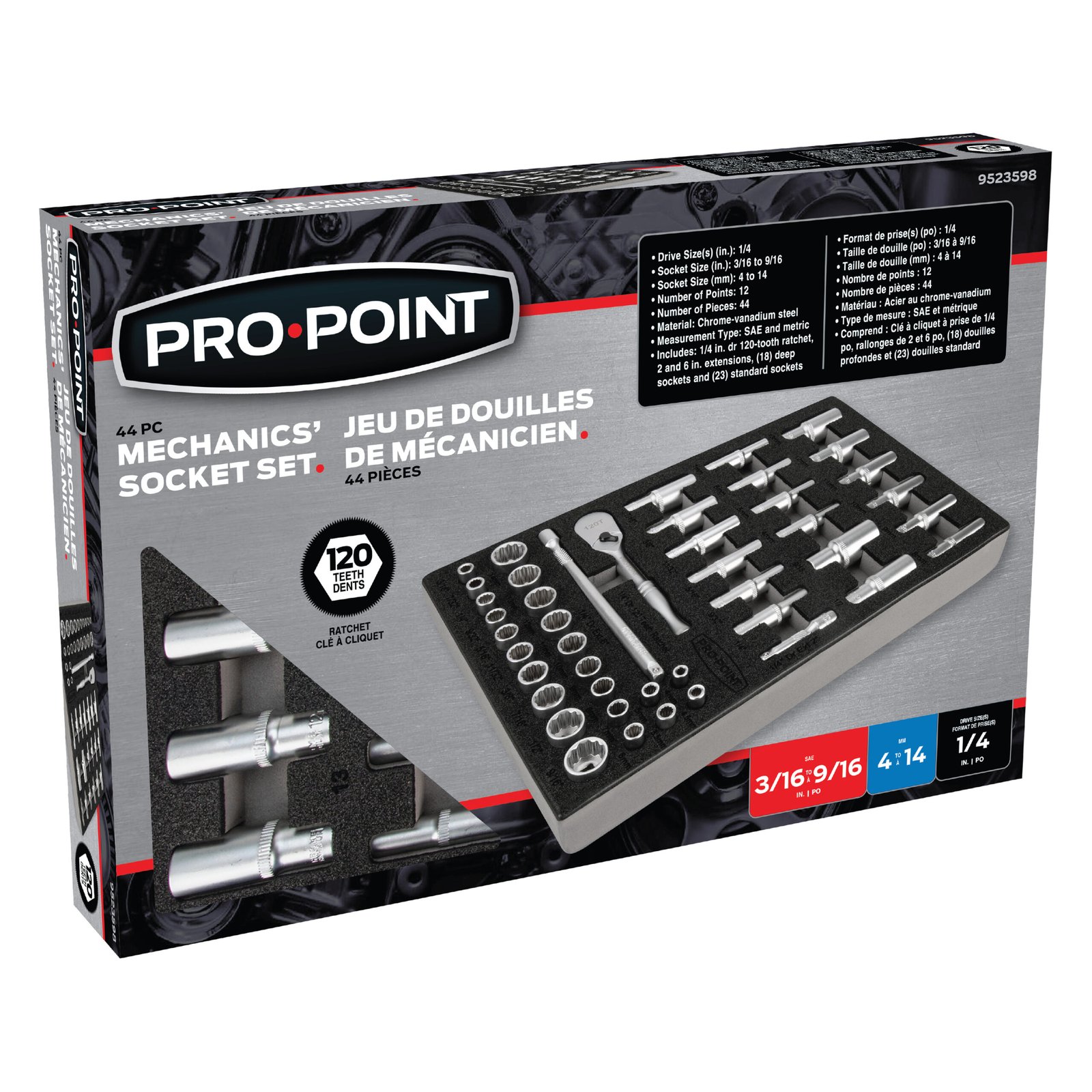
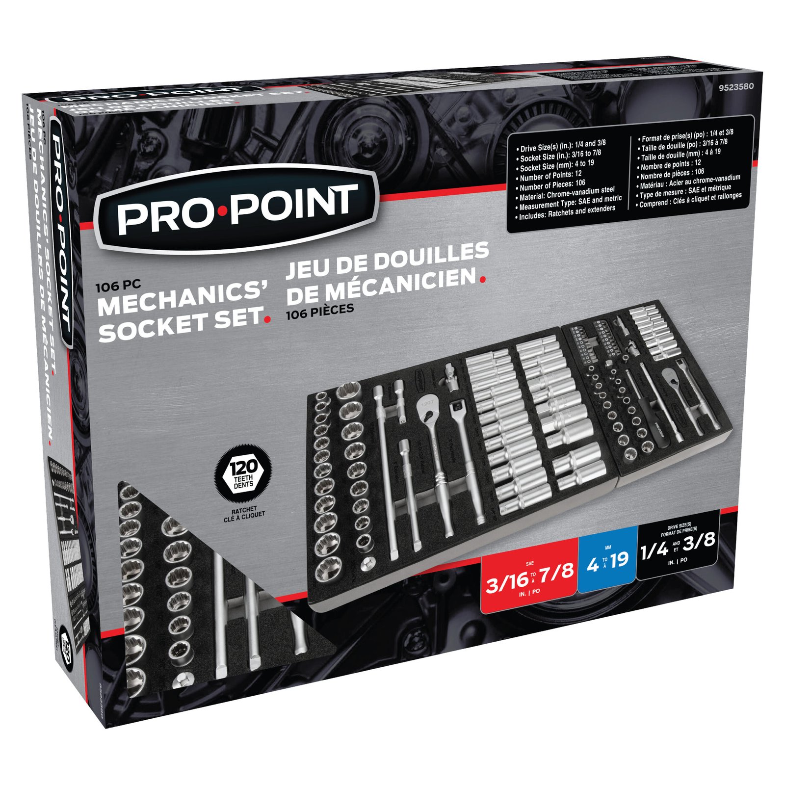
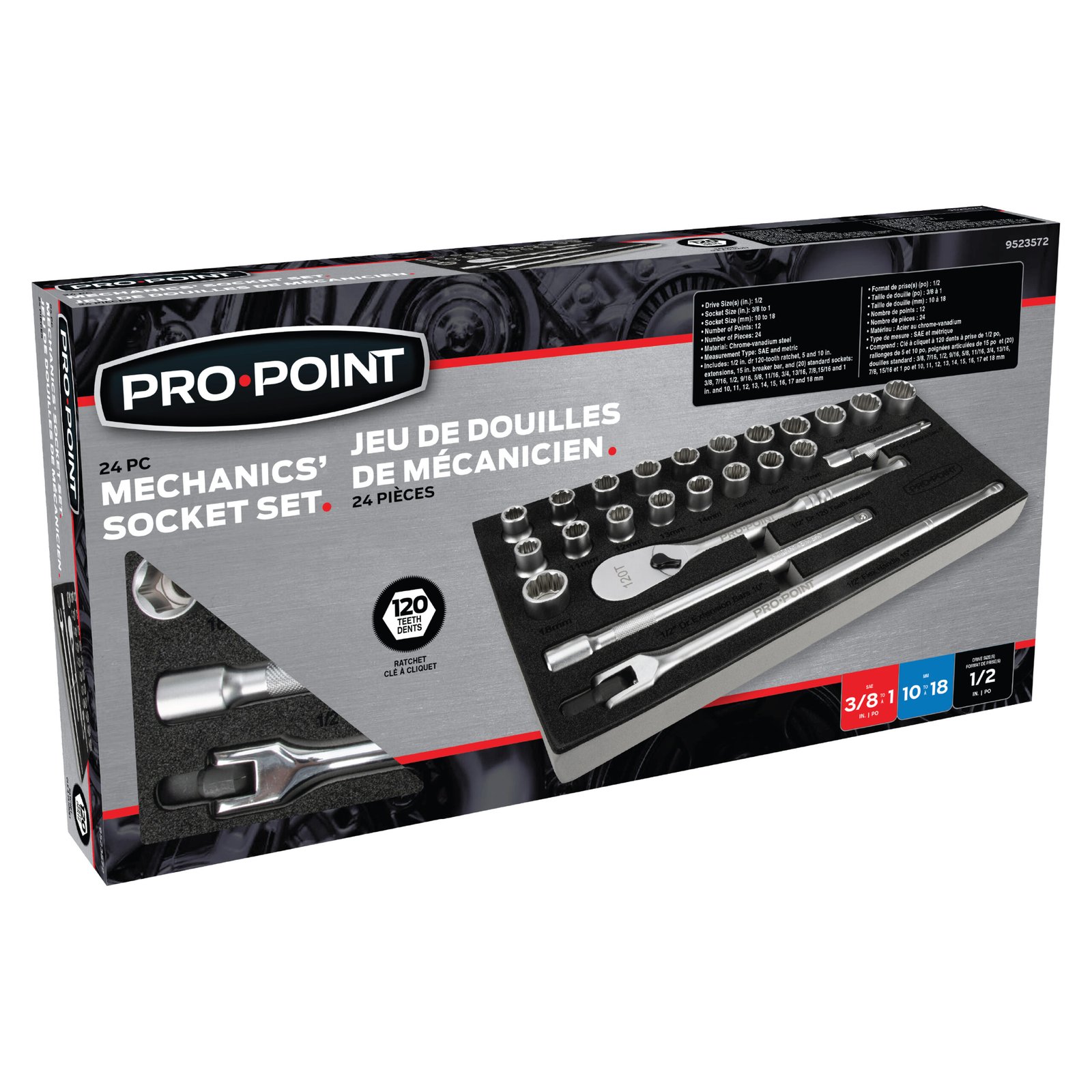
Pro.Point is a premium tool brand from Princess Auto, developed to serve customers who demand higher levels of performance, durability, and precision from their tools and equipment. The brand spans a broad range of professional-grade automotive, mechanical, industrial, and specialty tools, including high-torque impact tools, hand tools, shop equipment, and precision measuring products.


As a premium-tier brand within the Princess Auto product portfolio, Pro.Point packaging requires a more elevated approach to visual communication and product presentation. My work involved developing packaging that reinforced the brand’s professional positioning while clearly communicating technical specifications, product benefits, applications, and key features to customers in a retail environment.


The packaging work required maintaining a cohesive visual system across a diverse range of products while adapting the design to different formats, product categories, and levels of technical information. This included presenting products with specifications such as high-torque capabilities, specialized materials, and industry standards in a way that remained accessible and visually compelling at retail.

Scroll to Top