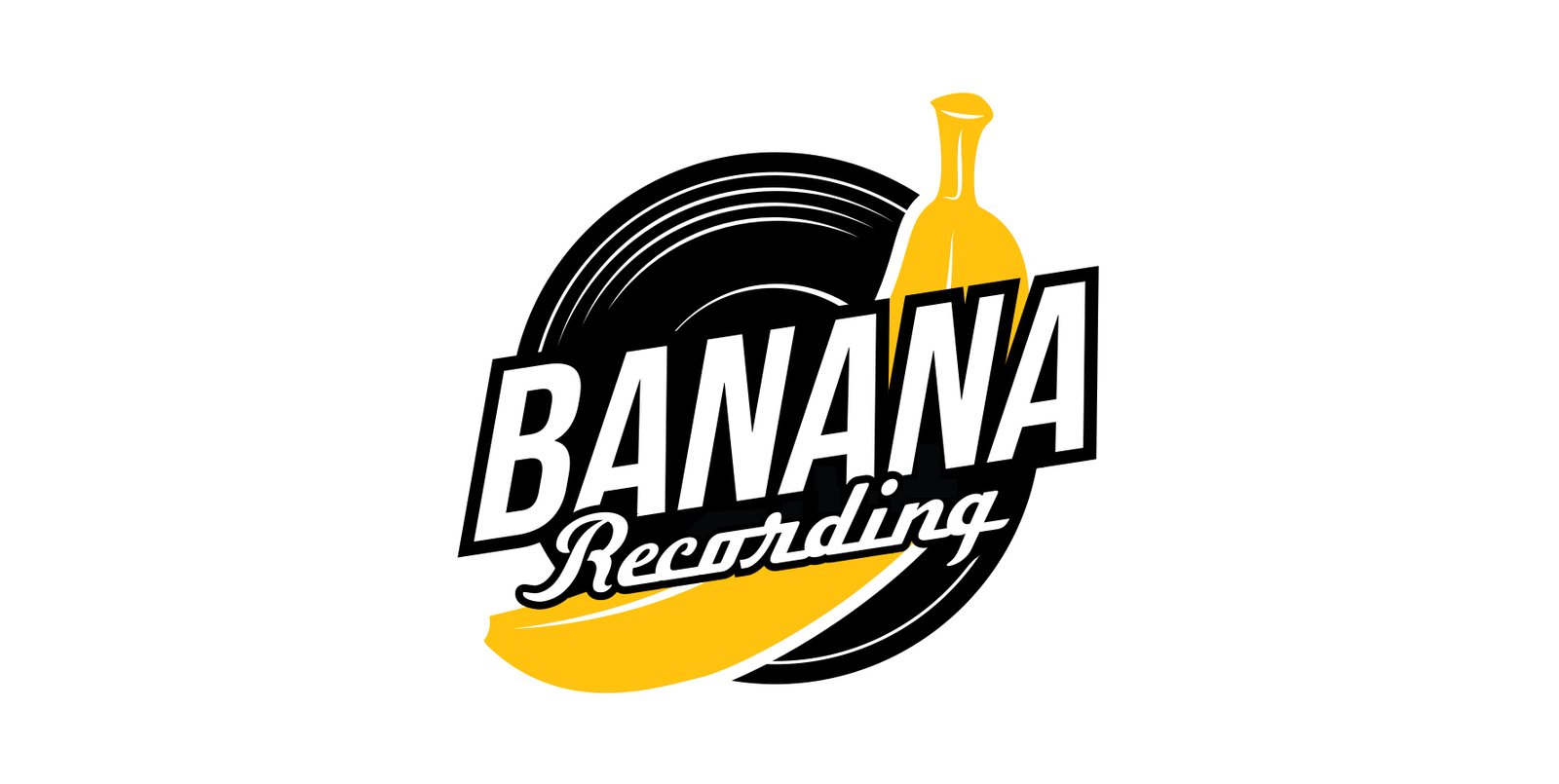
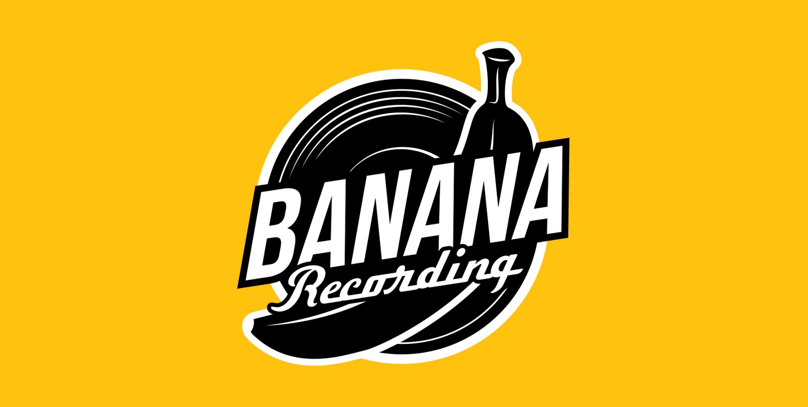
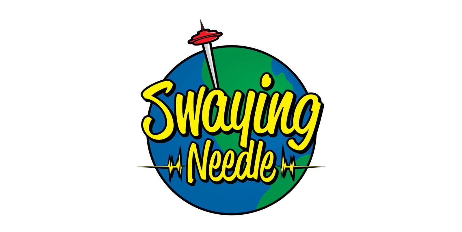
In the process of logo design, meticulous research and client collaboration are essential. Each logo project begins with understanding the company’s values, target audience, and industry landscape. By distilling key elements into visual symbols, I create logos that resonate with the intended audience and effectively communicate the brand’s identity. Through iterative design phases, incorporating feedback and revisions, I ensure the final logo accurately reflects the client’s vision and objectives. Whether for a rock band, recording studio, music promotion company, or youth organization, my approach remains focused on crafting timeless and impactful logos that leave a lasting impression.

BANANA RECORDING

Inspired by the company’s journey from a backyard music series to a thriving multimedia production company, the logo should reflect creativity, community, and growth. Incorporating elements reminiscent of acoustic sessions and multimedia production, the design aims to evoke a sense of intimacy and authenticity. Iterative brainstorming and collaboration with the founders ensure the logo captures the essence of Banana Recording’s mission: to help people tell their stories through creative content. The final logo serves as a visual representation of the company’s evolution and commitment to quality storytelling.

SWAYING NEEDLE

Designing a logo for Swaying Needle, a Seattle-based promotion company, entails immersing in the city’s vibrant music scene and understanding the company’s ethos. Inspired by Seattle’s iconic music culture and the company’s mission to promote local talent, the logo design seeks to evoke dynamism and innovation. Iterative brainstorming and collaboration with the company’s founders ensure that the logo captures the essence of Swaying Needle’s dedication to amplifying emerging artists. Through careful consideration of typography, imagery, and color palette, the final logo becomes a visual representation of Swaying Needle’s commitment to driving the music industry forward in the Pacific Northwest.

SNOHOMISH YOUTH VOLLEYBALL

Designing a logo for Snohomish Youth Volleyball involves understanding the local landscape and the organization’s ethos. Inspired by the majestic mountains surrounding Snohomish, the logo aims to convey a sense of strength, unity, and natural beauty. Through collaboration with the organization’s leaders, concepts are developed to incorporate elements such as mountainscapes and volleyball imagery, symbolizing both the local terrain and the sport’s vitality. Iterative design refinement ensures that the final logo strikes a balance between capturing the essence of the region and representing the spirit of youth athletics. The result is a distinctive and memorable emblem that embodies Snohomish Youth Volleyball’s identity.
Scroll to Top