 01
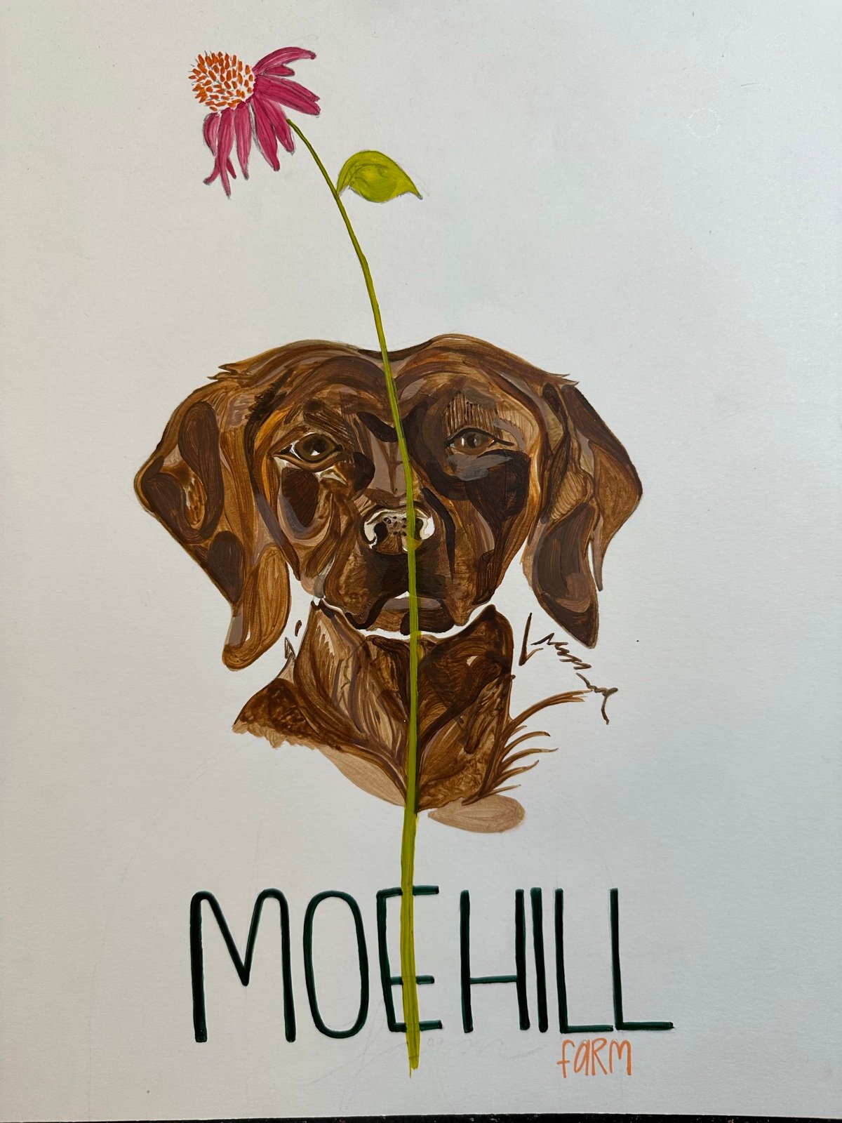
The Painting
A family member painted Moe, the farm’s chocolate Lab, with a coneflower and the farm name lettered by hand. Everything in the brand starts here.

Logo, color palette and packaging for a Flathead Lake farm.
I created Moe Hill Farm’s logo, color palette and brand identity from a family member’s hand painting of Moe, the farm’s dog, and I’m the lead designer on all of their packaging.
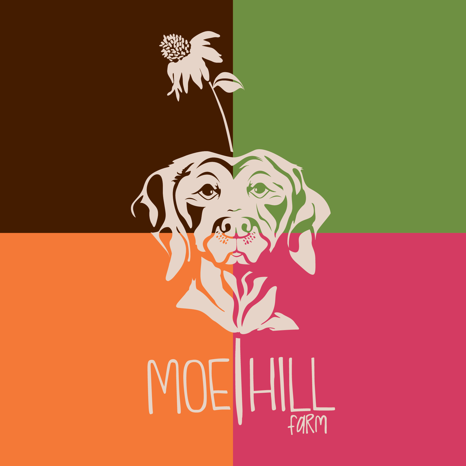
The primary logo and color palette, with alternates for wide formats, one-color printing and the wordmark on its own.
01A family member painted Moe, the farm’s chocolate Lab, with a coneflower and the farm name lettered by hand. Everything in the brand starts here.
 02
I redrew the painting as clean vector line art and kept the hand-lettered feel of the name, so the logo still reads as the family’s painting.
Chocolate brown, sage green, coneflower pink and orange, all pulled from the painting and specified for print and screen.
The full label artwork, with three details called out.
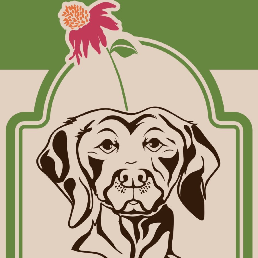
The logo’s line art anchors the front panel inside an arched frame.
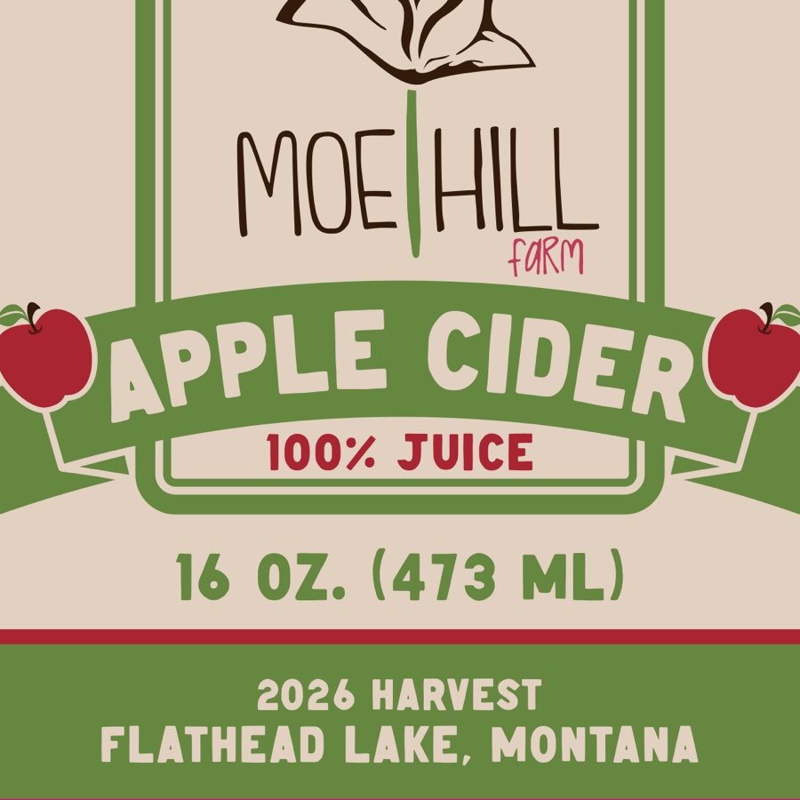
A bold banner, apples and the volume make the product clear at a glance.
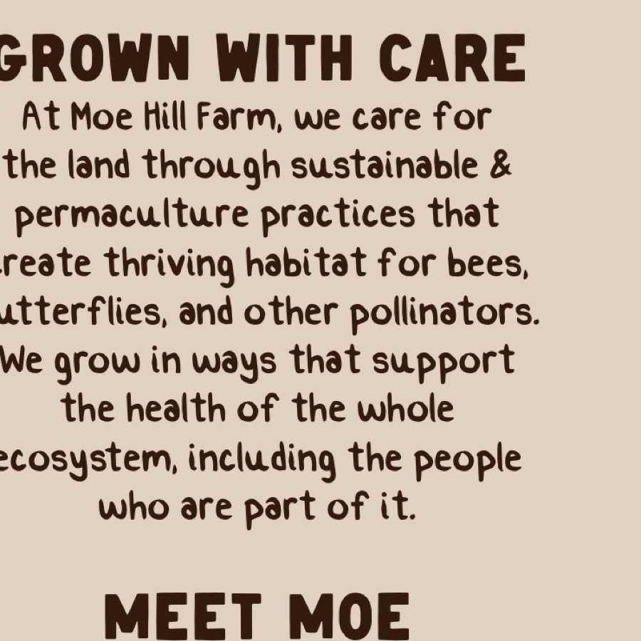
Side panels cover the farm’s growing practices, apple varieties and Moe himself.
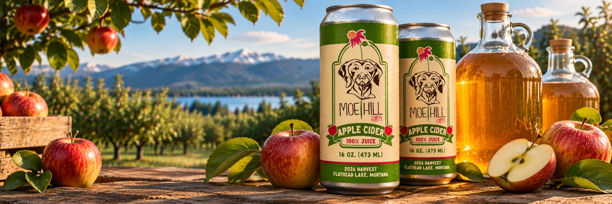
Mockups of the cider label on a can and a jug, and as a patch on a trucker hat.